Florence Nightingale Was Born 197 Years Ago, and Her Infographics Were Better Than Most of the Internet’s
The famed nurse was also an early practitioner of marshaling statistics to advance social causes.
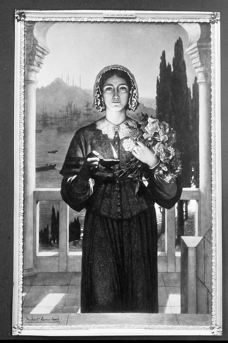
When someone mentions Florence Nightingale, who was born this week in 1820, one particular image likely comes to mind: A caring presence, head covered by a shawl, holding a lamp as she ministers to patients in the dark. The “Lady with the Lamp,” as she was known, still serves as a symbol for nurses everywhere.
But for every hour Nightingale spent burning the midnight oil to help a sick soldier, she likely spent another up late doing something else: working on some of the world’s first explicitly persuasive infographics. In addition to caretaking and advocating, Nightingale was a dedicated statistician, constantly gathering information and thinking up new ways to compare and present it.
In August of 1856, Nightingale headed home from her famous stint at Scutari hospital in Turkey, where, while working with injured and ill soldiers from the Crimean War, she successfully lobbied to improve conditions and to expand the role of nurses.* Upon her return to Britain, she was greeted as a hero—the press knew her as “a ‘ministering angel’,” and luminaries were eager to donate to training funds established in her name.
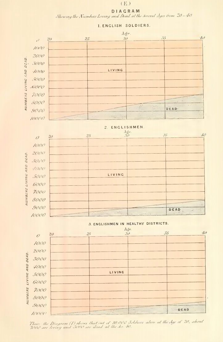
But in private, she had two things on her mind: death and statistics. Even if the most recent war had ended, there would be more, she reasoned, and without some kind of permanent reform, Nightingale feared all future wars would look much the same—full of needless deaths, even off the battlefield. “Oh, my poor men who endured so patiently,” she wrote to a friend in late 1856, thinking back on the soldiers she had treated who hadn’t made it. “I feel I have been such a bad mother to you, to come home and leave you lying in your Crimean graves, 73 percent in eight regiments during six months from disease alone.”
Nightingale had always had an affinity for math—as a child, she filled notebooks with tables of data about the fruits and vegetables in her garden, and according to one of her contemporaries, Francis Galton, she believed that statistics were the most effective way to “understand God’s thoughts.”
Her months in the war hospitals of Crimea provided her with plenty of opportunities to gather information, something that, in her view, those in charge had been fairly lax about. “The Army Medical Statistics… do not appear hitherto to have contemplated the necessity of [tabulating the sick at a given time],” she later wrote. “It cannot be ascertained correctly even for the Crimean Army.”
When she returned, sheafs of stats in tow, it was to a Britain gripped by its own numerical fervor. In 1834, scientists there founded the London Statistical Society, which aimed at “procuring, arranging and publishing facts,” in order “to illustrate the condition and prospects of society.” Three years later, the country set up a General Register Office to record births, deaths, and marriages. Soon, journalists and politicians were comparing sets of numbers in order to demonstrate particular correlations—between education and crime, say, or relationship status and longevity.
When, in February of 1857, the Secretary of War reached out to Nightingale and asked her to “communicate her opinions” about hospital treatments in Crimea, she saw her chance. Rather than drawing up some brief notes, she quickly began work on what would become Notes on Matters Affecting Health, Efficiency, and Hospital Administration in the British Army, an 850-page report that combines stories and observations with tables, graphs, and charts.
The report took her two years of near-constant work: peers, she wrote, accused her of “making my pillow of Blue-books.” It also taught her something surprising—far more Crimean War soldiers had died from preventable diseases than from anything else, including combat. What’s more, after a sanitary commission was sent to Crimea to clean up the hospital, death rates plummeted. These conclusions—and the data that supported them—were “like light shining in a dark place,” wrote her mentor and collaborator, the epidemiologist William Farr.
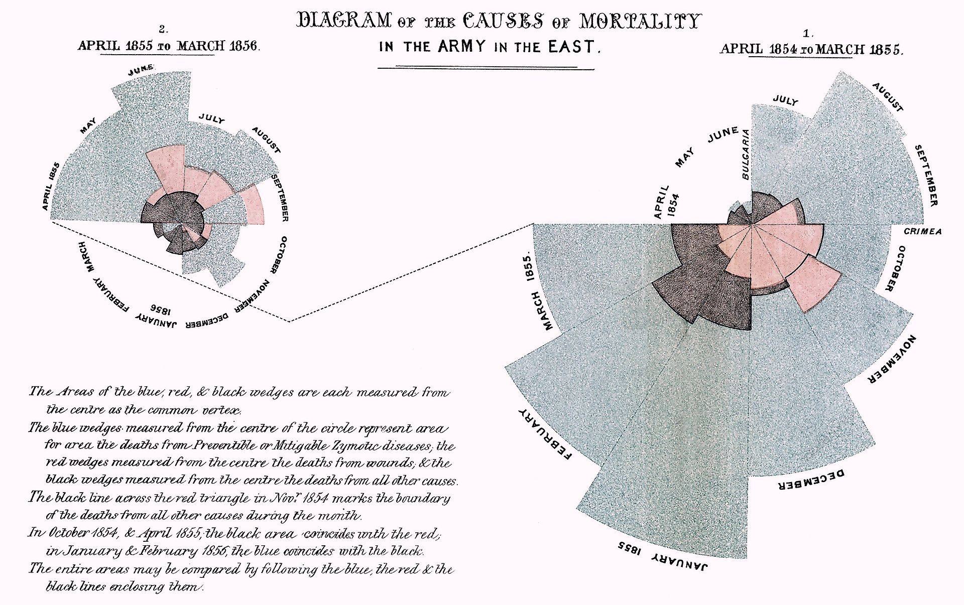
With such a massive tome on offer, though, Nightingale feared that this most vital conclusion might be overlooked. So she developed a series of charts meant to make it even clearer to the reader. Her most famous graph, displayed at the top of this article, shows the number of soldier deaths per month from various causes. Each pie slice represents a different month, from April 1854 through March 1856, and each color stands for a different cause of death. It takes just a quick glance to achieve the two main takeaways: that disease, colored blue, killed far more soldiers than either “wounds” (red) or “other” (black), and that it was reduced greatly in 1855.
Nightingale called this chart type—which she seems to have invented— “the coxcomb,” due to its shape and color. Although she wasn’t the first person to present statistics in chart form—that honor goes to William Playfair of Scotland, who published a book of infographics in 1786—“she may have been the first to use them for persuading people of the need for change,” writes the historian Hugh Small.
After she completed her report, Nightingale worked hard to turn its conclusions into common knowledge, privately distributing it to influential people and writing several more reports, many of which included coxcombs. When she received pushback from Army doctors, who thought sanitary measures a waste of money, she even leaked some of her charts to the press.
Eventually, Nightingale defeated said critics, and her findings won out. By the 1880s, sanitation standards in the British Army had greatly improved—soldiers were given the space and time to wash their clothing, bedding, and selves more regularly, among other reforms—and these gains had spilled over into the general population as well. As the statistician Jil Matheson told the Guardian in 2010, “the ‘Lady with the Lamp’ was also a lady with powerful ideas”—and it’s those ideas that truly helped Britain shine.
*Correction: This post previously stated that Scutari Hospital was in Crimea. It was in Turkey, near modern-day Istanbul.


Follow us on Twitter to get the latest on the world's hidden wonders.
Like us on Facebook to get the latest on the world's hidden wonders.
Follow us on Twitter Like us on Facebook