Hypnotizing Moving Maps of Bird Migration Patterns
An occurrence map for the American Pipit. (Image: eBird.org)
Want to be mesmerized by an expanding orange glow while being reminded of how little and flightless you are? Then eBird.org’s bird occurrence maps, which track the movement of 57 different bird species across the US using lava lamp-esque visuals, are perfect for you.
The maps, produced by the Cornell Lab of Ornithology with support from the Leon Levy foundation and National Science Foundation, are predictions for how likely you are to find any given bird on a one kilometer walk at 7 a.m. in the morning. They are built from a massive collection of data–280 million observations from around the world submitted by thousands of birdwatchers–and use a method known as the Spatio-Temporal Exploratory Model (STEM).
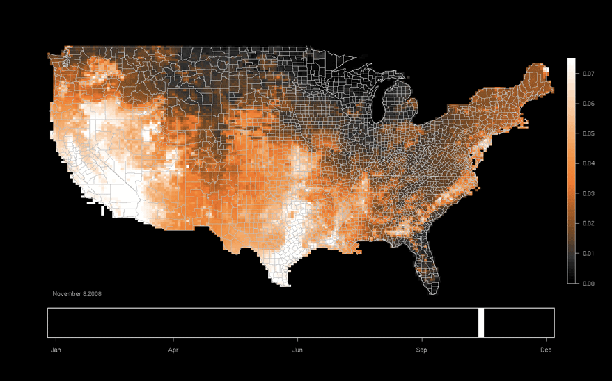
 Migration map in motion for the Swainson’s Hawk. (Image: ebird.org)
“By taking all those observations and correcting for distance, duration, and time of day, and then tying those in with habitat variables from satellite coverage—then we can tie birds to the habitats on the ground,” explains Marshall Iliff, the project leader. All of this data, with averages across multiples years, combines to create a nuanced look at bird distribution for each day of the year.
Iliff says these occurrence maps are “hands down the most exciting thing that has come out of the whole eBird project.”
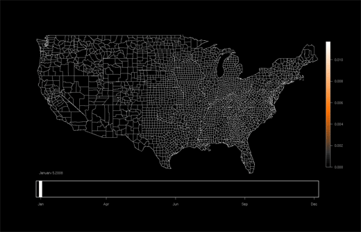 Seasonal patterns of the Hermit Warbler. (Image: eBird.org)
Since eBird started in 2002, bird enthusiasts have been using the site to record individual sightings and track general patterns of bird movement. The database has been expanding exponentially ever since, and is now a data lover’s paradise.
Each map comes with an explanation of a species’ appearance and habitats, migration habits and trends. The maps show year-round migration patterns for the Lower 48 states, and eBird is already researching an expansion to Canada, Central America, and South America that will incorporate satellite-sensed data.
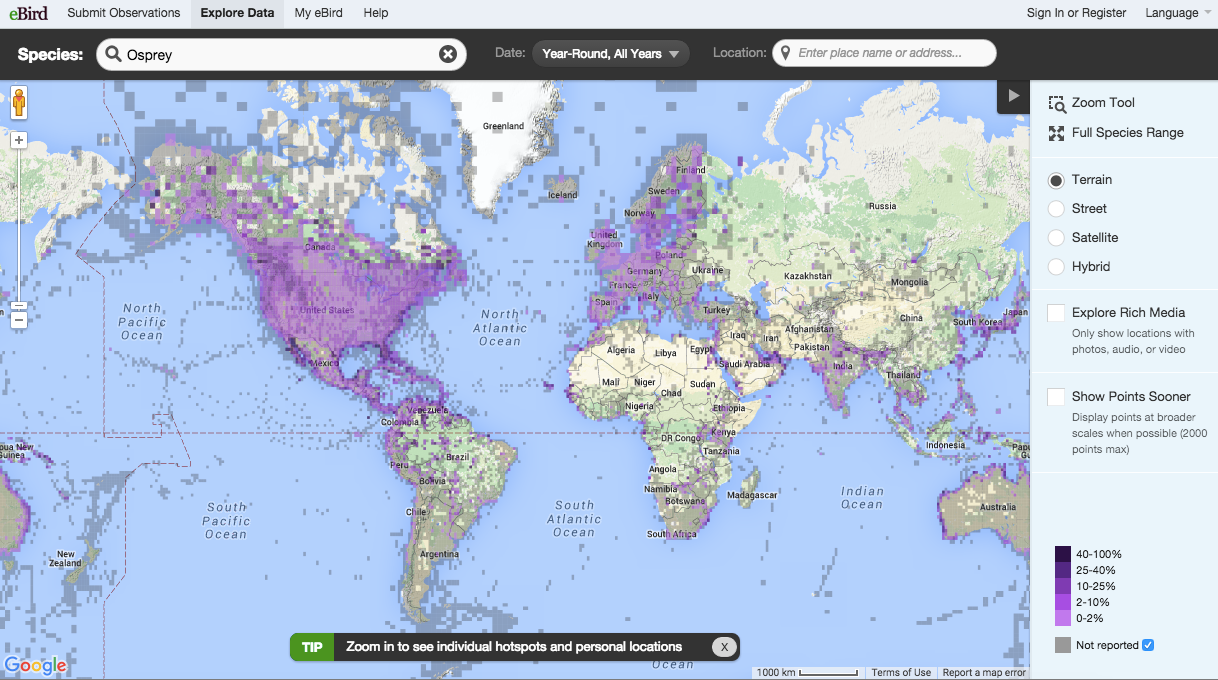
The Species Maps let you see where certain bird species globally reside. This map is for the Osprey. (Image: eBird.org)
Start delving into the worlds of the lazuli bunting, dickcissel and white-eyed vireo, and you may have trouble pulling yourself away. In addition to the captivating occurrence maps, the site also features the Species Map, an interactive world map that lets you type in a bird species (say, American flamingo or Vogelkop Bowerbird) and see where on Earth it resides.
Their Line Graphs let you figure out what types of birds to expect in certain locations throughout the year. There’s even a Submission Map where you can watch people across the globe log their sightings in real time, which is unexpectedly thrilling.
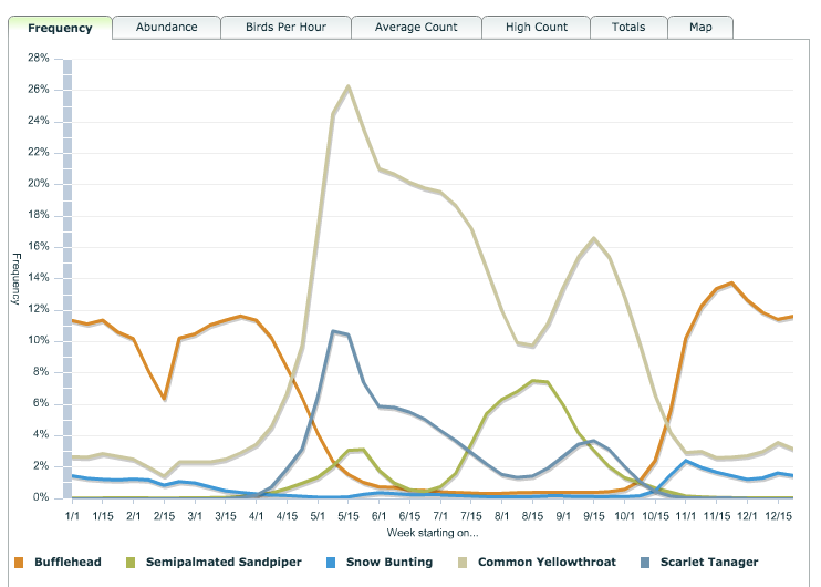
This line map shows the range of migratory strategies for five different species. (Image: eBird.org)
Probably the most exciting thing about the occurrence maps, says Iliff, is that they’ve been used in tangible conservation efforts. For example, the maps have contributed to the U.S. government’s State of the Birds report, which studies bird protection and conservation. It’s a positive, self-propelling cycle: birdwatchers submit data; data contributes to conservation efforts; and conservation efforts enable more birdwatching.
By the time you finish ogling these maps and exploring the many other data-driven goodies on offer, you will know significantly more about the birds of America. You’ll likely want to find some bufflehead, greater scaup, and sooty shearwaters in the wild yourself. Time to go grab those binoculars and get birding.
Map Monday highlights interesting and unusual cartographic pursuits from around the world and through time. Read more Map Monday posts.


Follow us on Twitter to get the latest on the world's hidden wonders.
Like us on Facebook to get the latest on the world's hidden wonders.
Follow us on Twitter Like us on Facebook