The Exquisite 19th-Century Infographics That Explained the History of the Natural World
“Humboldt’s Distribution of Plants in Equinoctial America, According to Elevation Above the Level of the Sea”–from Black’s General Atlas, engraved by George Aikman.(Image: Geographicus/WikiCommons Public Domain)
Today, in search of a way through a constantly expanding morass of information, people often turn to infographics—points of data, spatially arranged to help visualize the relationships between them. They’re helpful and nice to look at. You probably have six in your inbox right now.
But infographics, despite their current ubiquity, don’t belong to the information age. The desire to present data in a way that emphasizes both its beauty and its interconnectedness goes far, far back—all the way to the beginning of the 19th century, when pioneering naturalist Alexander von Humboldt invented the ”thematic map.”
An early map of Humboldt’s, illustrating the various phenomena that make up Tenerife, one of the Canary Islands. (Image: Beinecke Rare Book and Manuscript Library/Public Domain)
In 1799, Humboldt set out for the New World, where he spent half a decade exploring Latin America on behalf of the Spanish government. The novelty, variety, and beauty of what he encountered there—the rock formations, the weather, the plant and animal life—convinced him that the branches of scientific inquiry were more entwined than anyone had previously thought.
Like his contemporaries, Humboldt believed in the power of collecting and classification, and as he traveled from Venezuela, through the Andes, and up to Mexico, he filled notebook after notebook with measurements, drawings, and observations. Inspired by the economic charts that had recently come into fashion, he began developing a new kind of map that would allow him to synthesize the thousands of pieces of data he had collected into a complete picture—one that might, as he put it, “show the simultaneous action and connecting links of the forces which pervade the universe.”
A map correlating snowcap heights and sizes with latitude, from The Geographical Atlas of the New Continent, an early work. (Image: Beinecke Rare Book and Manuscript Library/Public Domain)
For example, the map at the top of this page, first sketched by Humboldt in 1807, features a cross-section of Chimborazo, a mountain in the Andes. The scientific names of subterranean and terrestrial plants are placed at their exact elevations, along with further data about everything from zoological life to temperature. As Humboldt related in his first travelogue, with this map he aimed to assemble all the area’s physical phenomena into one image:
namely, the vegetation, the animals, the geological facts, the cultivation of the soil, the temperature of the air, the limit of the perpetual snows, the chemical constitution of the atmosphere, its electrical intensity, its barometrical pressure, the decrement of gravitation, the intensity of the azure color of the sky, the diminution of the light during its passage through the successive strata of the air, the horizontal refractions, and the heat of boiling water at different heights.
A map of the Rio Grande de Magdalena, in Colombia, from Humboldt’s 1801 diary. (Image: Staatsbibliothek Berlin/WikiCommons Public Domain)
Humboldt returned to Europe and published his work, where he quickly became well-known for—in the words of his contemporary and translator Helen Maria Williams—“his peculiar manner of contemplating nature in all her overwhelming greatness … [and] raising the mind to general ideas, without neglecting individual facts.”
Near the end of his illustrious career, Humboldt published a collection of lectures called Kosmos, in which he intended to cover everything worth knowing about the entire universe. These lectures were illustrated with a companion atlas of further “thematic maps,” which again synthesized enormous amounts of data, this time on a national or global scale.
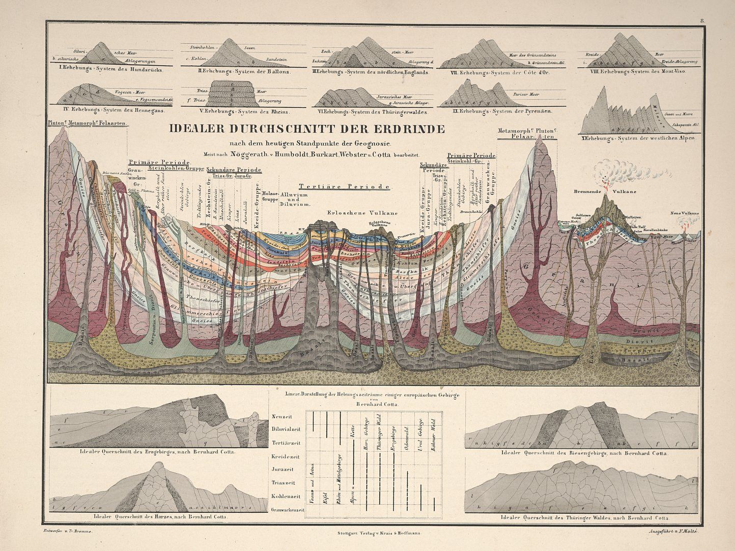
A plate from Atlas of Alexander von Humboldt’s Kosmos, illustrating the composition of the Earth’s crust via color-coding. (Image: Botanicus/Public Domain)
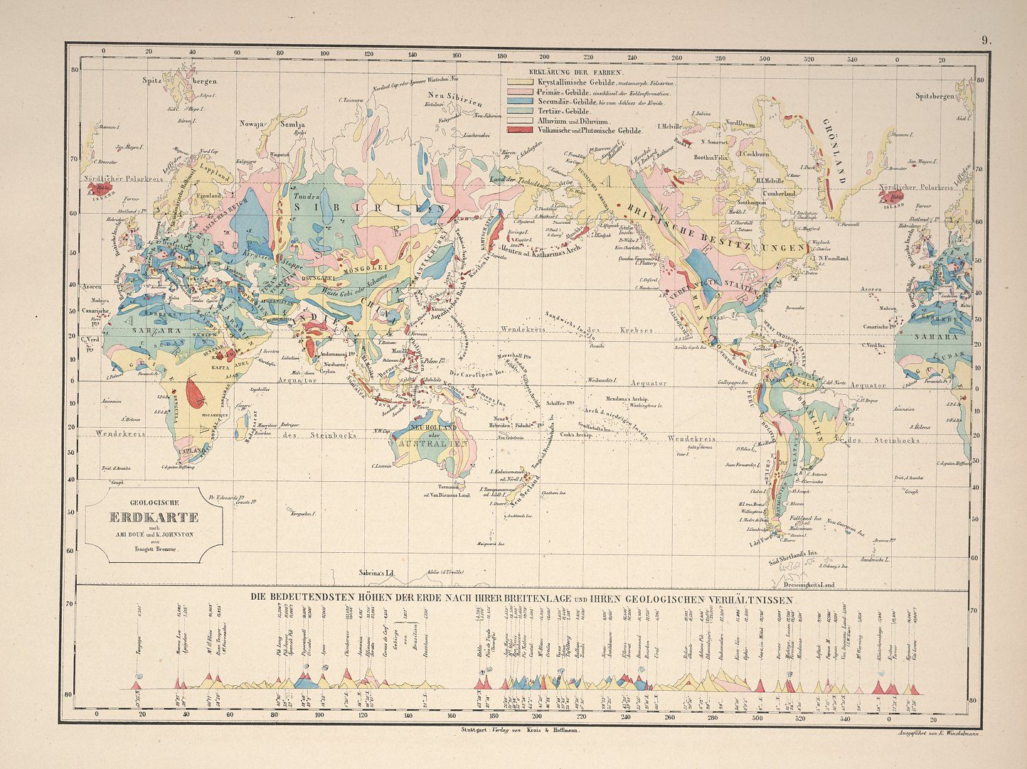
A geological map of the earth, color-coded according to primary rock type—pink is crystalline and metamorphic, red is volcanic. (Image: Botanicus/Public Domain)
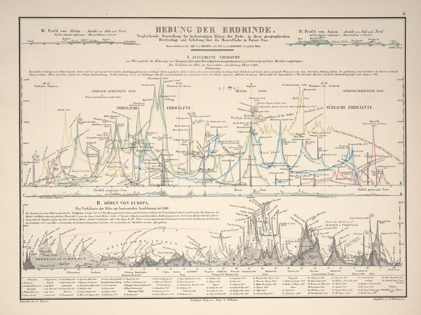
Another plate from the Atlas, this one plotting the tallest mountains in the world in terms of how far they are from the equator. (Image: Botanicus/Public Domain)
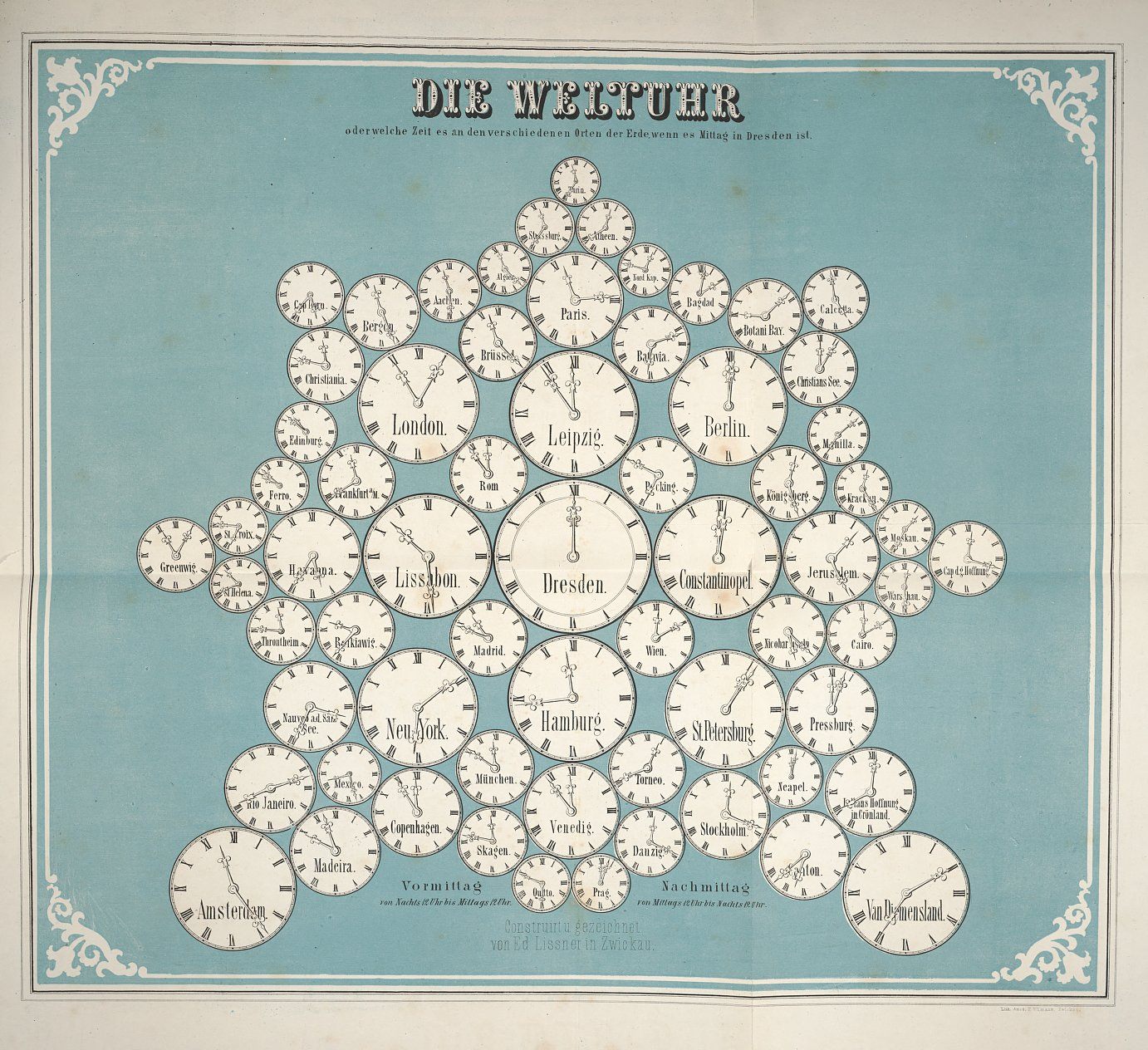
Some of Humboldt’s visualizations were simpler and more playful. Here, a snowflake of clocks illustrates world time zones, with Dresden at the center. (Image: Botanicus/Public Domain)
After Humboldt’s death, several of his students continued his legacy—most notably Heinrich Berghaus, whose Physikalischer Atlas, published starting in 1845, was meant to build on his teacher’s work. Berghaus applied the principals of thematic mapping to yet more disciplines, from hydrology to zoology, and brought it to an even wider audience. Some of Berghaus’ creations—featuring volcanoes and snakes!—are below.
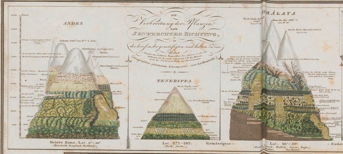
Detail from a Physikalischer Atlas map representing plant distribution by altitude, a clear descendant of Humboldt’s work. (Image: University of Utrecht/Public Domain)
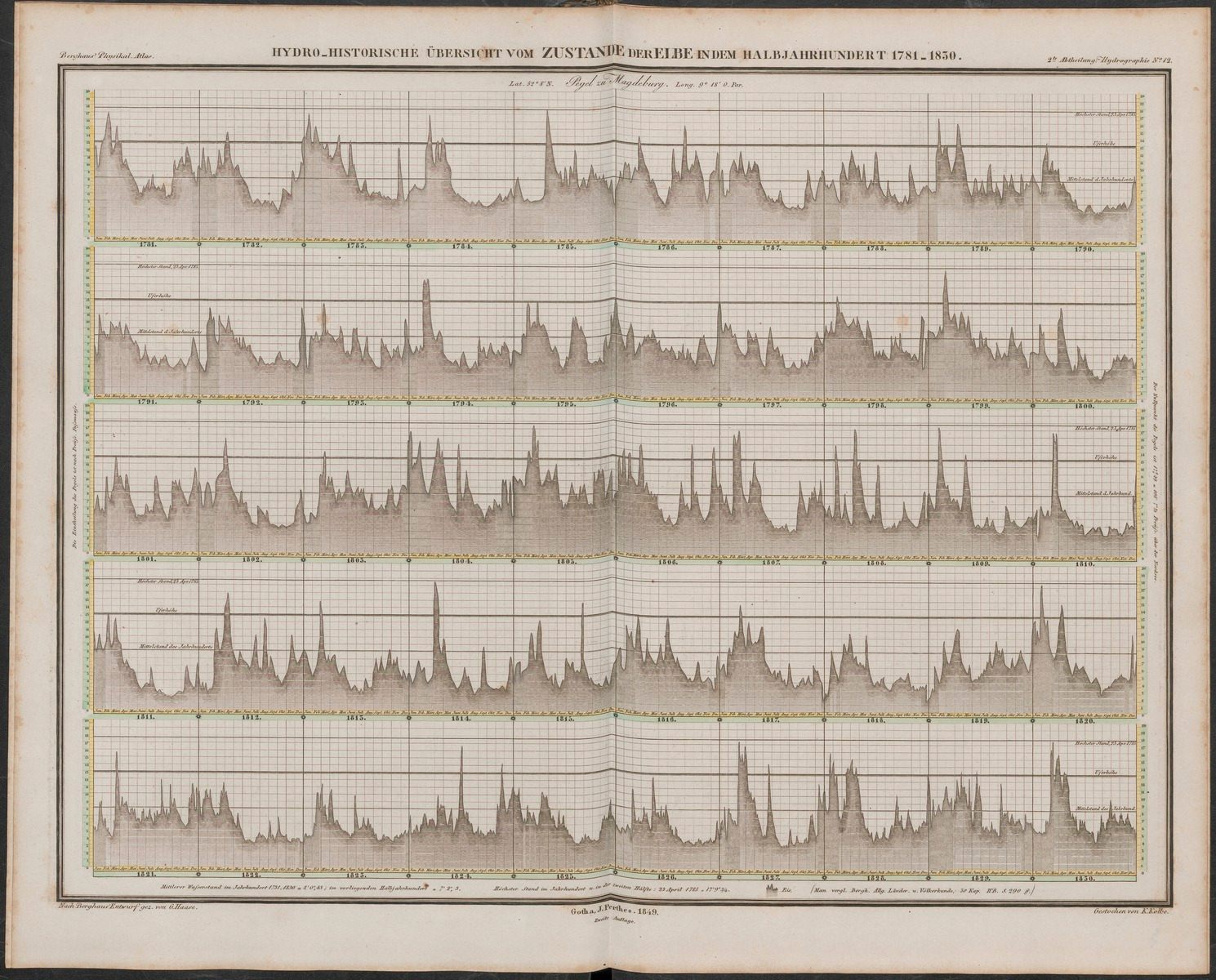
A chart of monthly and annual water levels in the Elbe River from 1781 to 1830, from Berghaus’s Physikalischer Atlas. (Image: University of Utrecht/Public Domain)
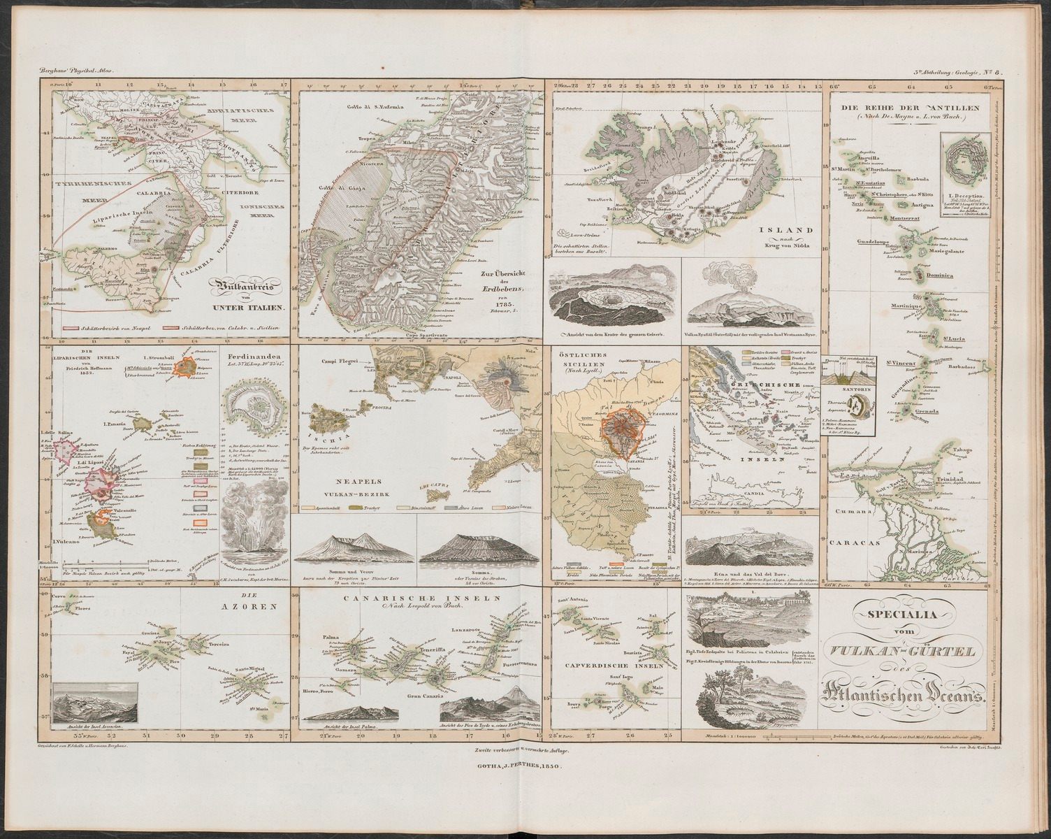
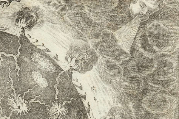
A comparison of volcanic sites across the Atlantic Ocean, from the Physikalischer Atlas. (Image: University of Utrecht/Public Domain)
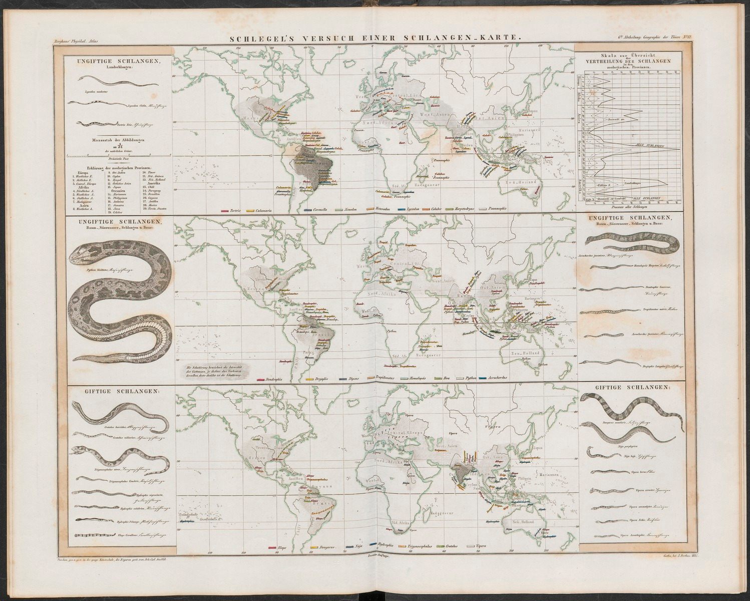
A helpful map of worldwide snake distribution, also from the Physikalischer Atlas. (Image: University of Utrecht/Public Domain)
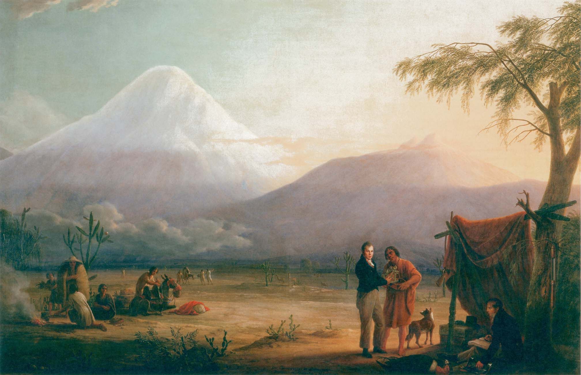
Humboldt, his research assistant Aimé Bonplant, and a South American guide in front of Chimborazo. (Image: Friedrich Georg Weitsch/WikiCommons Public Domain)
Updates, 1/11 and 2/11: The original version of this article said that Humboldt began his explorations in 1899–it was, of course, 1799. It also said that one particular chart shows rainfall in the Baltic; it instead charts water levels in the Elbe River. Thanks to Harold Roth and Jason M for the corrections, and we regret the errors.


Follow us on Twitter to get the latest on the world's hidden wonders.
Like us on Facebook to get the latest on the world's hidden wonders.
Follow us on Twitter Like us on Facebook