How Climate Change Affects Cartography
Mapmakers talk about how they approach shifting coastlines and melting ice.
The maps in the 10th edition of its Atlas of the World, published in in 2014 by the National Geographic Society, were similar to those in 50 years’ worth of previous editions, from the familiar outlines of continents to the Society’s patented font.
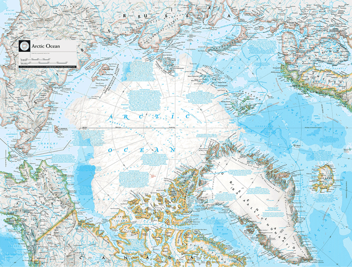
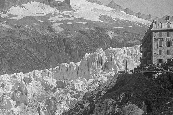
But there was an important difference—the shape of the Arctic.
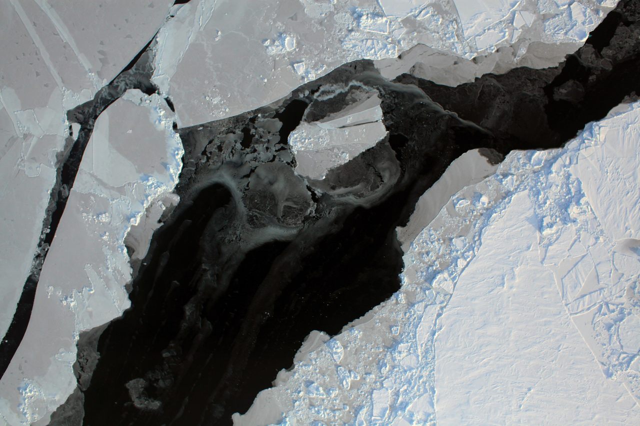
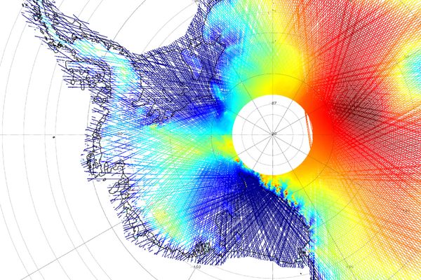
Using data from NASA and the National Snow and Ice Data Center, the atlas remapped the area in 2013 to show how the Arctic’s ice sheet had receded. The change was so extensive that former President Barack Obama mentioned it in a speech on global warming. But as soon as the cartographers had finished drawing, their map was already out of date—and it’s growing increasingly so by the day.
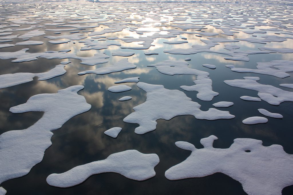
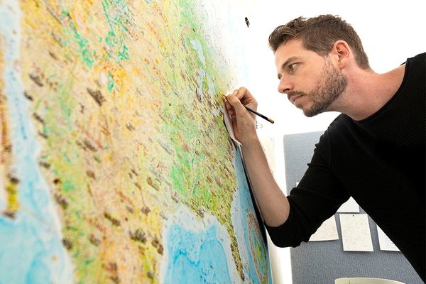
“The sea ice changes monthly and daily so it’s very hard to capture it in one static image,” explains Rosemary Wardley, a senior GIS cartographer at National Geographic Maps, and part of the world atlas team.
To capture this state of change, the mapmakers have attempted to portray the Arctic “a little differently” in its recent updated visual atlas, to present data about the state of the sea ice over time and during different seasons. The ice has a more “physical look” and a less “solid, white feel.” “We wanted to make sure the user could see the multiyear ice [ice that survives more than one melting season] and that while it’s something solid, it is changing,” says Wardley.
It is often political changes—new countries, names and borders—that prompt the redrawing of maps of the world. Governments and international bodies confirm these details to mappers. But when physical features change, “there’s more wiggle room,” says Wardley. “There’s no authority on how the world is changing.”
The scale of climate change makes representing it difficult, too. “It’s not on a human scale, it’s on more of a geologic scale that’s difficult for the layperson to take in,” says Wardley.
For mapmakers, capturing something that can change the world’s physical features so rapidly is a challenge.
“The vision of maps as static and hung on the wall collecting dust is ingrained in our culture because that’s how we’ve treated maps for hundreds of years,” says Alastair Bonnett, professor of social geography at Newcastle University in England, and author of Beyond the Map.
“It’s difficult for us to move to the new world where not only is the planet changing fast but maps are struggling to keep up. But change we must.”
In an effort to tackle this and buoyed by advances in digital mapping tools, groups such as MapAction and Humanitarian OpenStreetMap (HOT) are changing what maps can look like, how they can be used, and who can make them.
HOT “activates” on-the-ground and remote mappers to help countries and humanitarian organizations prepare for and respond to natural disasters. A mapper online may be presented with a single square of satellite imagery and be asked to draw over any roads or buildings. This information is used to create and update a digital map, which can then be used by aid agencies or emergency responders, for example.
“Mapping, which was historically thought of as this technical, highly-skilled thing, becomes something that’s just drawing and saying we need just these two things to enable humanitarian work,” says Rebecca Firth, HOT’s community partnerships manager.
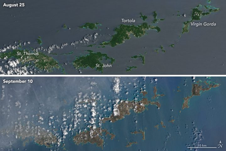
The organization’s efforts have recently focused on mapping five concurrent disasters, from hurricanes in the Caribbean to flooding in South Asia, attracting more than 4,800 volunteers. These rapidly updating maps show the effects of extreme weather and climate change on people and populations. Firth says there has been a rise in requests for “vulnerability and exposure mapping” in the past 12 months, too, as more of the world’s population experiences climate-change risk.
Collaboration and digital tools may help mapping overcome the struggle to keep up with a changing climate. Drone imagery recently allowed HOT to provide same-day updates to maps after landslides in Colombia, removing the wait for a government program to remap the area or for Google to update its images.
Yet, in the push to be up-to-the-minute to cover the effects of climate change, older maps should not be discarded. Wardley’s team used the updated 10th edition of the Nat Geo atlas as an opportunity to compare how the world map had been drawn over the last 50 years. A gif on National Geographic’s website shows a swathe of pale blue water eventually eclipsing the north and north-west portion of the Arctic ice, the blue font of the words “Arctic Ocean” fading into the background.
At Covehithe in Suffolk, England, the coastline is disappearing by meters each year. Bonnett says he realized he was looking out from the low clifftop onto where Doggerland, an ancient piece of land which joined the UK to northern Europe, would have been. The country of Doggerland was once home to Stone Age settlers, but was lost beneath a rising North Sea after global warming following the last ice age some 12,000 years ago.
“We are joining or becoming connected with previous generations who have witnessed great climate change and the disappearance of their land,” he says. “There’s a sense that climate change can make us think about our relationship to people from distant generations who also had to experience sudden and dramatic climate change, though not humanly caused.”
By 2050, an estimated 66 percent of the world’s population will live in cities, driven in part by climate change, such as extreme flooding or drought in rural areas. Expanding cities are at increased risk from the effects of climate change, as mapped by the European Environment Agency. They also require new maps to help us understand them.
“We live in layers stacked up. A 3D map is hard to navigate partly because we are so used to maps being flat,” says Bonnett. “It’s not just a question of physical changes and data changes, but of us trying to get our heads around new dimensions in mapping.”


Follow us on Twitter to get the latest on the world's hidden wonders.
Like us on Facebook to get the latest on the world's hidden wonders.
Follow us on Twitter Like us on Facebook