The Controversial Process of Redesigning the Wheelchair Symbol
It has its own emoji, but where did the new Accessible Icon come from?

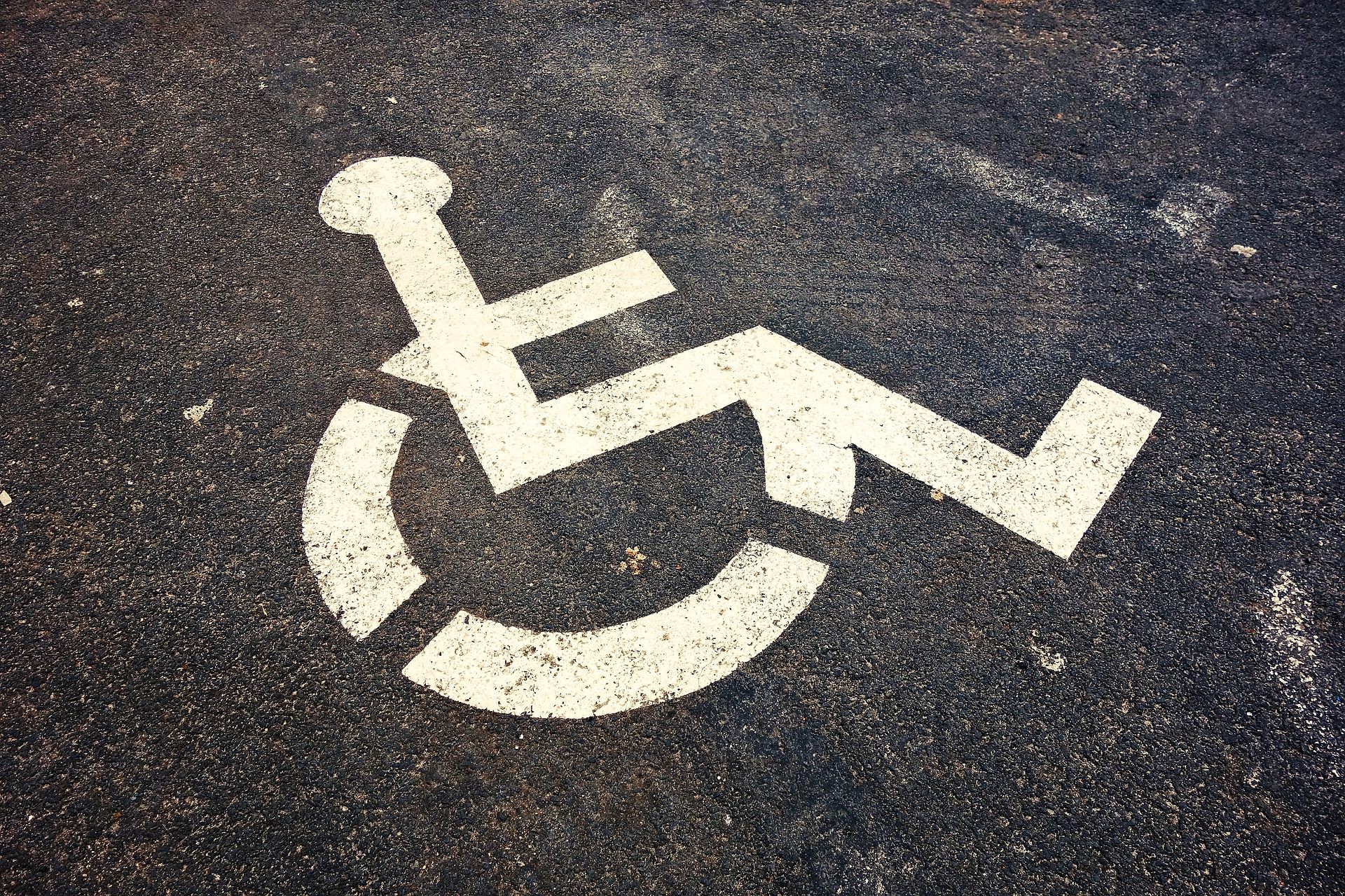
Just 50 years ago, the International Symbol of Access did not exist. Known variously as the Wheelchair Symbol and “the little blue sign,” the icon features an individual sat on their wheelchair, apparently motionless, with their arms perched on the sides. Created by the Danish design student Susanne Koefoed in 1968, in the original version, the person on the wheelchair was missing a head.
Today, the ISA appears all throughout the built environment: bathrooms, accessibility ramps, automatic doors, parking lots. It has become part of the world’s ISO-ordained pictographic vocabulary—as instantly recognizable as signs that tell you which bathroom to use, where the elevators are, or not to smoke. For decades, it has served as a way to tell people with disabilities “you are welcome here,” in a world that doesn’t always make the arrangements for accessibility that it should.
“It’s something that we sort of take for granted,” says Rochelle Steiner, co-curator of the exhibition Access+Ability currently on show at the Cooper Hewitt, Smithsonian Design Museum in New York. “That we see all over the U.S. and all over the world as a symbol of disability.”
Over the last few years, however, a rogue icon has rolled quietly into sight. The “Accessible Icon,” as it’s known, began as a Boston-based street art project. In the past eight years, however, it has mushroomed into an international movement, with the symbol now on signage around the world. The symbol has even been codified in emoji, appearing on iOS devices in a cluster of blue squares, between P for parking and WC for water closet. Yet however ubiquitous it may appear, this rival wheelchair symbol has prompted a spectrum of reactions. It has variously been called ableist and empowering; officially rejected by the ISO; and deemed federally illegal, despite having been adopted by the states of New York and Connecticut. But where did it come from, and why has it provoked such controversy?
The Accessible Icon was by no means the first attempt to adjust the 1968 Wheelchair Symbol. Around 2009, the design and disability studies researcher Sara Hendren began cataloguing alternative accessibility icons on her blog, Abler, where she also tracked developments in prosthetics and topics related to the human body. Without fanfare or hubbub, in certain corners of urban space, the figure in the wheelchair had been ever-so-slightly adjusted. In some iterations, the person’s body was simply less blocky, with organic, rounded shoulders and arms—arguably more recognizably human than Koefoed’s original stick figure. In other variations, the person’s arms reached back to push their wheels.
Hendren began to notice these altered icons across the United States—in the bathrooms of MOMA in New York, for instance, or in a Marshalls department store in Cambridge, Massachusetts. They were subtly different—in the Marshalls version, speed lines had been added to show a person in motion—but each made some effort to show a person with disabilities moving around the world. Brian Glenney, a graffiti artist and philosophy professor at Norwich University in Vermont, saw potential for a project. In a comment on Hendren’s original blog post in late 2009, he wrote: “I suggest a tagging run of these. We create the signage and ‘replace’ old signs … What would be best is an ‘overlay’ design, that makes use of the passive wheelchair image but makes it active.”
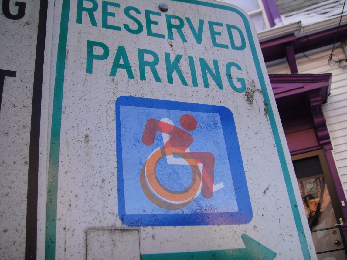
Together, Glenney and Hendren designed a transparent overlay of a person in a wheelchair, colored a vivid orange. The figure in the wheelchair seems dynamic—the outline of two wheels suggesting furious motion, with their torso shunted forwards, as if propelling themselves into some glorious unknown. In 2011, around 1,000 of these icons were pasted over the top of existing accessibility icons around Boston, in an attempt to generate questions about what Hendren describes as “disability and the built environment, in the largest sense. … Framing this work as a street art campaign allowed it to live as a question, rather than a resolved proposition. At least at the outset.”
They had had no intention of creating a new symbol, or even in leading the charge for widespread adoption of their design. It was, Glenney says, simply a street art project “that got a lot of attention and traction.” But as the decals received more and more media coverage, they realized that there was genuine hunger for systematic change.
So, to move from guerilla design activism into functional, socially aware design, the pair partnered with Tim Ferguson Sauder, a professional graphic designer, to bring the icon in line with professional standards. They scrapped the orange, adjusted the wheels so that it could be easily stenciled, and then thrust it out into the world in September 2012, making it open source, so that it could be used by the people who needed it the most. “We switched gears,” Glenney says. “We essentially said: ‘This is yours, now. We’re putting it into the public domain. Please, just take it, and do what it what you will.’ That’s kind of the way that things changed.”
In the years since, Hendren and Glenney have seen hundreds of icons in use all over the world. It’s on parking information at a hospital in Delhi, India; on a printed U.S. Department of Treasury sign; stenciled on curbs; and in MoMA’s permanent collection. Organizations such as the nonprofit Triangle Inc., which is based in Malden, Massachusetts, have used it as a way to bring people with disabilities together, employing them to replace signs and icons across the country. Other campaigners have still greater designs: The Forward Movement, in Ontario, Canada, wants the “Dynamic Symbol of Access,” as they call it, introduced across the province, and currently have six cities, including Toronto, on board.
Those anxious for change see the old symbol as a relic of an unsatisfactory past. Like the word “handicapped,” which was removed from New York state signage in 2014, advocates say the ISA icon is dated both in design and what it represents. The Canadian activists Jonathan Silver and Dylan Itzikowitz, who are behind the Forward Movement, believe the ISO symbol places the emphasis on the wheelchair and disability, before the person. By contrast, they say, the new symbol “shows movement, a symbolic action that emphasizes differing abilities.”
Mike Mort, who runs the blog Disabled Identity, also favors the new icon. “I don’t mind the older symbol,” he says, “but I definitely think this is a step, roll if you will, in the right direction. To me, the more active look of the ‘revamped’ icon better represents the freedom and equality that accessibility truly brings.” It might not represent him absolutely—Mort is a power-chair user—but he appreciates the meaning behind it, and acknowledges that “it’s impossible to capture the diverse experiences and needs of the disabled community with a singular design.”
Some detractors do object to the design itself, and what it might imply, however. In 2016, CT News Junkie quoted Cathy Ludlum, from Manchester, Connecticut, who spoke publicly about Connecticut’s embrace of the new icon. Ludlum has spinal muscular atrophy and professed her preference for the old symbol. “The old symbol leaves everything up to the imagination,” she said. “The new symbol seems to say that independence has everything to do with the body, which it doesn’t. Independence is who you are inside.” Like the figure in the old symbol, she said, “I am blocky and rigid.”
Others are more concerned about its origins. Glenney speaks with clear regret about the people who see it as ableist, “because the people that designed it weren’t people with disabilities. That’s definitely something that I’m sympathetic to, I agree with,” he says. “Had we known that our little street art project was going to change into something that was an advocacy project, we wouldn’t have done it the way that we did it. We would have essentially taken a back seat, and worked with people with disabilities, and have them design it and apply it. We would have just collaborated with them.”
But what many do seem to agree is that, at the end of the day, a symbol change can only do so much—what matters most of all, Mort says, is the accompanying dialogue about how people with disabilities are viewed within society. Brendon Hildreth from North Carolina, who uses a wheelchair and has been involved with advocacy work for the Accessible Icon Project, feels the same. Hildreth says he’d like to see the new symbol adopted alongside contextualizing information that explains why change is necessary. “I hope the new symbol can bring about conversation as to what is necessary for a person with disability needs in their community,” he says. “Accommodations should be automatic.” And even if some of his colleagues in the disability activism community don’t agree on the specifics of the design, Mort says, the very fact that these discussions are taking place is powerful.
Perhaps surprisingly, Glenney and Hendren are comfortable—pleased, even—with people disliking the symbol, and its official rejection from many standardizing institutions. Its existence, they say, has facilitated discussions that might otherwise never have taken place. “My favorite thing about this project,” Glenney says, “is that it gave [Ludlum] a platform to talk about how she views her disability. That’s the success of our project.” The icon’s limited legality and adoption seems, in a sense, to serve as a kind of metaphor for the restricted access that many people with disabilities experience all the time. “We really like the situation we’re in,” Glenney says. “It gives visibility to the context of people with disabilities. It keeps them ‘in the market’ of ideas, so to speak. Our symbol is most successful when it’s not fully legal—when there’s lots of wrinkles and questions.” As long as conversation channels are open, he says, there’s still the possibility for change even greater than the simple replacement of one blue and white sticker with another.


Follow us on Twitter to get the latest on the world's hidden wonders.
Like us on Facebook to get the latest on the world's hidden wonders.
Follow us on Twitter Like us on Facebook