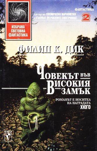
How Book Designers Around the World Interpreted Philip K. Dick’s ‘The Man in the High Castle’
Earlier this year, Amazon released the first episode of The Man In the High Castle, a series adapted from Philip K. Dick’s classic 1962 novel of paranoia, espionage, and science fiction in a Nazi-controlled America, with the rest of the series set to debut in the fall.
It’s not the first time that the book has struggled to be understood, as shown by its collection of wildly disparate covers from around the world.
The novel takes place in an alternate universe where the Nazis won World War II, and have now divided up America into regions controlled by the Germans and the Japanese. The story follows a diverse cast of characters as they explore the tense relations between the two nations and the history of the country they occupy, as well as the mysterious rebellion being fomented by a science fiction book called, The Grasshopper Lies Heavy, which tells the radical tale of a world where the Nazis lost. It’s heady stuff, but the title has led many people to mistake it for a different novel entirely. This is never more apparent than on many of the book’s old covers from around the world, the illustrations of which range from strangely accurate, to designs from people who don’t seem to have read past the first page.
 (All images from Philip K. Dick.com)
This American edition is actually a pretty great representation of the themes of the book, save for the actual castle in the background which screams fairy tale.

Okay, hands down, this cover from Finland is the best symbol of the book’s world ever conceived, although to someone unfamiliar with the contents, it seems to say that it is an Iron Chef novel.
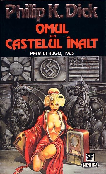
Another awesome foreign cover, this time from Romania, which features a pretty loose set of objects and symbols from the book. Although the middle-school titillation of the geisha figure seems a bit out of step with the novel’s pervasive anxiety and misery.

This Chilean cover is pretty abstract, but it does have a grasshopper from the novel-within-the-novel, and a man (suggesting that there are male characters?) but it’s pushing it.

Similarly, this Polish edition seems to be communicating that Japanese culture has a role in the novel with a big piece of kanji slapped over what looks to be a reused fantasy illustration.

Estonia’s take on the book seems to have interpreted the title and not much else, since it looks like a cover to Lord of the Rings.

One Portuguese edition split the book into two volumes, and went the technicolor route, getting the swastika and a castle on the first volume before this…

…sure there is a castle, but there is also a rainbow, a green sun, and a swatch of cloth? Good luck identifying this as a book about oppression and Nazis.

Speaking of weird celestial objects, many of the covers seem to have not even read the title and known only that Philip K. Dick wrote pulpy science fiction. This is from Turkey.

A castle, maybe?

One of the Spanish versions seems to have decided on some sort of tornado golem.
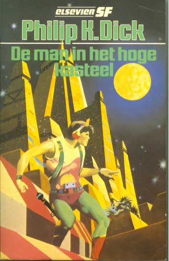
The Dutch offer up the novel as the story of an intergalactic disco star on the run.

Then some of the covers are clearly just strange shots in the dark, such as this bizarre surrealist masterpiece.

There is also this Greek cover that seemed to think the novel was a travel guide from the swinging ’60s of some sort.
Finally there is this Bulgarian cover which… well, we leave it to you to decide what is going on here.


Follow us on Twitter to get the latest on the world's hidden wonders.
Like us on Facebook to get the latest on the world's hidden wonders.
Follow us on Twitter Like us on Facebook