How the Universal Symbols for Escalators, Restrooms, and Transport Were Designed

The down arrow and information symbols. (All symbols: Courtesy AIGA)
In 1977, several nursing mothers wrote to the U.S. Department of Transportation (DOT). They weren’t happy. They objected to the new standardized symbol for “nursery,” which depicted a baby bottle, and they wanted it changed.
Today, travelers rushing through an airport or pausing at a roadside rest stop barely notice the standard symbols that direct the flow of human traffic. The little rounded man indicating the restroom and his female partner with her triangular dress are too familiar to think twice about. The same goes for the ubiquitous No Smoking logo and the knife and fork symbol that point towards dinner.
But 40 years ago, when the DOT received the letters, the symbols were new, launched to help manage the crush of visitors for the U.S’s Bicentennial celebrations. Symbols have long been helpful in transcending cultural and linguistic barriers—in the 20th century, they became particularly common in cities hosting the Olympics. When planning for the Bicentennial, the DOT realized that standard symbols could be used to direct international tourists as they enjoyed everything the country had to offer 200 years after its founding.
To determine what these symbols ought to look like, DOT approached the American Institute of Graphic Arts (AIGA), the nation’s oldest and largest professional design organization. Together, they reviewed hundreds of symbols in use around the world and set out to develop their own set that could convey diverse messages to America’s tourists.

Currency exchange.
“I think about it as another assignment we did,” says Roger Cook, whose graphic design firm Cook and Shanosky Associates Inc., was contracted by the AIGA to design the symbols. Today, Cook is 85 and retired but continues to work as an artist out of his home in rural Bucks County, Pennsylvania. “We didn’t make a killing on it,” he laughs. But he acknowledges the thrill of knowing that his firm’s work has reached so many people and will live on long after he and his partner, Don Shanosky, are gone.
Designing the initial 34 symbols took nearly a year, and the project was so intense that the firm worried they might lose other clients. In the pre-computer era, Cook and Shanosky drew hundreds of sketches on tracing paper and discussed them with the AIGA’s project committee, turning in version after version of each symbol. The committee discussed each draft in exacting detail, returning pages of notes to Cook and Shanosky, which today fill a giant, overstuffed binder that Cook has kept for years.
The yellowing, typewritten notes cover nuances that most travelers today don’t even notice. But that’s good, Cook says. “People don’t have time to sit and figure out what the symbol means.” Good design should be about simplicity, and the committee’s notes demonstrate the intensive process of what Cook describes as “deleting all the unnecessary dingbats and doodads without losing the impact of the message.”

The universal symbol for restrooms.
Simplicity began with the male figure. The character built upon previous stylized figures from earlier symbol sets, but Cook and Shanosky’s own sleek, no-details figure set the tone for the other symbols in the DOT set. The figure has since been dubbed Helvetica Man by the designers Ellen Lupton and J. Abbott Miller, a name Cook appreciates. Like many designers, he has a deep respect for the font Helvetica and its clean, no-frills appearance.
Creating simple, easily understood symbols required that the designers grasped the essence of what they were trying to communicate. Understanding the basics of the human form is relatively easy, and even differentiating gender with Helvetica Woman’s dress seemed a straightforward enough task. But the design team also needed to tackle more complex, abstract subjects. For example, how do you portray authority—what makes Helvetica Man official? Apparently, a hat is the answer, and a sash across his chest and waist, as shown in the symbols for customs and immigration (in the pre-TSA days, the design group dismissed a similar symbol for airport security, noting that it’s “not an official person who does security”). It’s strangely effective; there’s nothing like an official-looking hat to give a person an air of authority.
 “Helvetica Man” as a customs officer, with his official hat and sash.
The discussions at the meetings covered the minutiae of Helvetica Man’s many escapades as the designers placed him in the various situations needed to convey messages to travelers. His posture as he sits in a waiting room chair was of concern, and the notes on the Waiting Room symbol are filled with maternal chiding: “Make person sit up straight,” and “Figure should not be too slouched.” Waiting rooms, it turns out, are not happy places. Helvetica Man shouldn’t be too comfortable, or people might get confused.
There was also a debate about whether to include Helvetica Man in the symbol for stairs. Look at the design we know today—a single line, bent into ascending or descending right angles—and it’s hard to think anything except “stairs.” But before there was a universal symbol, it was unclear how much detail was necessary, and the committee thought a figure using the stairs might make the symbol clearer. Eventually, they took him out, concerned that his inclusion leaned too much towards an illustration, rather than a symbol. But they made the opposite decision for the escalator symbol, deeming the escalator without Helvetica Man too abstract to be specific.
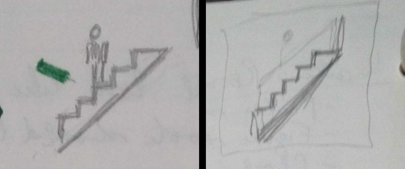
Early sketches for the “stair” symbol included a Helvetica figure, which designers later removed to make the symbol simpler, although they kept him in the “escalator” symbol. (Photo: Cook and Shanosky Associates, Inc.)

The symbols for stairs and escalator. The stairs symbol has no person present, as it was felt it looked too much like an illustration. However for the escalator, the person was seen as sufficiently abstract.
The committee debated whether to include Helvetica Man’s arm as he takes a drink from a water fountain, eventually deciding that the arm was needed to show he’s not bowing to the fountain. Should the No Dogs dog have a rounded nose or a squared off one? Rounded, consistent with Helvetica Man, won. Did the man with a raised arm and a suitcase, signaling passenger pick-up at arriving flights, look like he’s hailing a cab or waving to a friend? Could he be mistaken for curbside check-in? The symbols were drawn and redrawn until everyone—the DOT, the AIGA, the designers, even the friends and family the designers sometimes ran their ideas by—was satisfied.
When the committee had finalized 34 symbols, the DOT initially debuted them in New York, Boston, Philadelphia, Washington D.C., and Williamsburg, VA. The department also urged their adoption by federal, state, and transportation authorities, and soon they were everywhere. The New York Times announced their arrival, and they were introduced to millions of schoolchildren in the classroom magazine My Weekly Reader. Johnny Carson even did a segment on them.
Requests rolled in for symbols to meet unaddressed needs—a fire extinguisher; a “no weapons” icon. The Consulate General of Iran wrote to request a “no photography” symbol. Cook and Shanosky worked with the AIGA and the DOT to add 16 additional symbols in 1979 and five more in 1985. They changed one of the three male figures riding in an elevator to a female figure. And they assented to the requests of the nursing mothers, swapping the bottle for Helvetica Baby, who today tells parents all over the world where they can change their own babies’ diapers.
 The baby symbol, which replaced the baby bottle.
In 1985, Cook and Shanosky’s firm won an inaugural Presidential Design Excellence Award for the symbol project. But for Cook, there’s also a less tangible reward. “We’ve told more people where to go,” he says. “We probably have the record on that.”


Follow us on Twitter to get the latest on the world's hidden wonders.
Like us on Facebook to get the latest on the world's hidden wonders.
Follow us on Twitter Like us on Facebook