Why Map Historians Are Annoyed With Boston Public Schools
The district started phasing in the Peters Projection, to much fanfare. But is it really better than the Mercator?
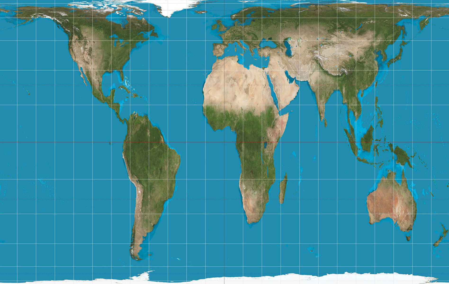
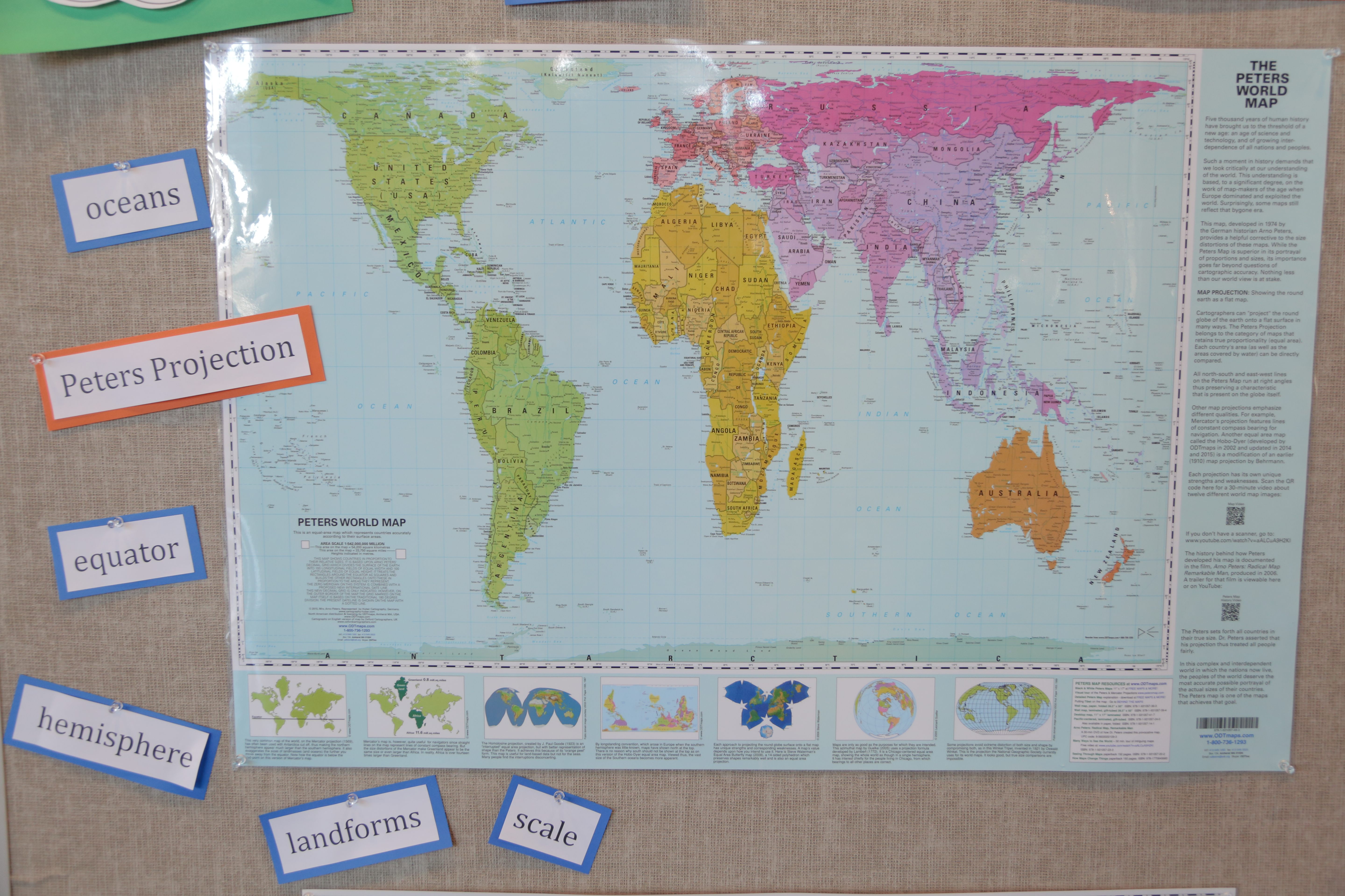
Earlier this month, the social studies classrooms of Boston Public Schools underwent a slight but significant change in decor. Their walls were already hung with the Mercator Projection—a common choice of world maps for schools—which distorts the size of each land mass but keeps continental shapes intact. But now the classrooms have received a different projection,* the Peters, which stretches out the world in order to give each continent a proportionally accurate amount of room. On the Peters, Canada—so huge on the Mercator—shrinks to its proper size, while Africa, which the Mercator shows shrunk and jammed beneath a too-large Europe, stretches out.
Boston educators are celebrating the choice. “It was amazingly interesting to see [the students] questioning what they thought they knew,” social studies director Natacha Scott told NPR after the Peters was introduced. And news articles about the phase-in tell a tidy story, in which a more enlightened representation of the world rightfully replaces an outmoded one.
But many map historians are privately disheartened—not by the addition itself, but by the resuscitation of the Mercator-Peters rivalry, a conflict that has bedeviled public-facing cartography for decades, and which they see as a manufactured, false choice.
“News of Boston public schools’ decision to go with the Peters projection has gone viral over the past week, and my teeth have not stopped itching,” Jonathan Crowe writes on his blog, The Map Room. “There are a large number of other map projections, many of which are better than either one of those,” says Mark Monmonier, author of Rhumb Lines and Map Wars: A Social History of the Mercator Projection. Even Ronald Grim, curator of the Norman B. Leventhal Map Center at the Boston Public Library, had concerns: “In my mind, both the Mercator and the Peters are controversial projections,” he says in a phone interview. “But we were not asked to be part of the decision.”
Making a map projection is a necessarily difficult task. The Earth is resolutely three-dimensional, and any attempts to smooth it out are going to add a certain amount of warping. It’s a balancing act: the more accurate you make the continents’ relative area, the more you have to distort their shapes, and vice versa. The art of cartography lies in choosing to privilege one or another of these accuracies—or finding a sweet spot between them that serves your particular purpose.
No one is overly fond of the Mercator. It’s over 400 years old, and its flaws are legion. The Flemish cartographer Gerardus Mercator, who came up with the projection, was trying to enable sailors to plot a smooth, straight course across the ocean. To accomplish this, he had to sacrifice accuracy in other areas, namely, the relative sizes of the continents. In the Mercator Projection, land masses near the equator—such as Africa and South America—are squished, while those near the poles, like Alaska and Northern Europe, are stretched out. Meanwhile, Antarctica is rendered so large that map publishers often don’t bother to include all of it. In the process, they generally recenter the world vertically on Europe, rather than the equator.
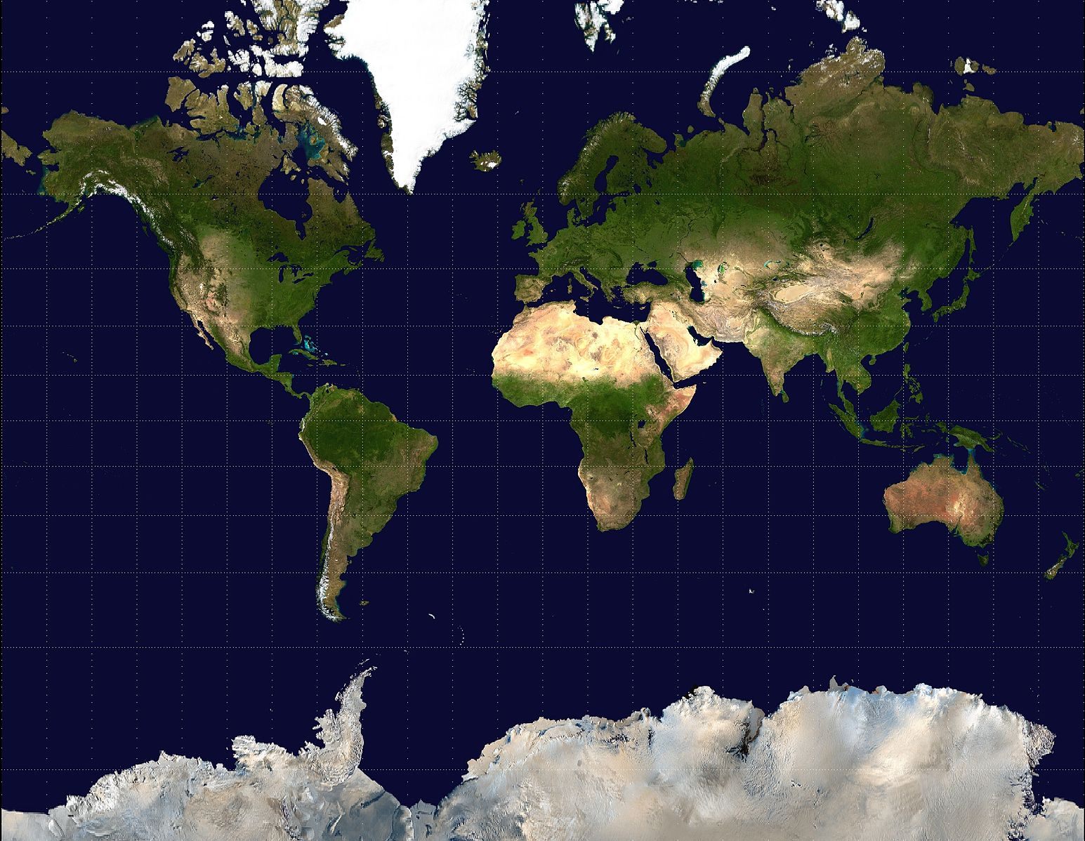
In the past, white supremacists have celebrated these geometric incidentals. “[The Mercator] has been used by some pro-Western, pro-Imperial types in the 19th and 20th centuries to map the world, as Europe and North America look much bigger than they are vis-a-vis the more tropical areas they exploited,” writes Matthew Edney, a professor of cartographic history at the University of Southern Maine, in an email. Others argue that by enabling exploration in the first place, the Mercator is an inherently colonialist map. And in the present day, its ubiquity contributes to a virulent strain of racially inflected geographic ignorance—for instance, it makes Africa appear to be the same size as Greenland, when it’s really about fourteen times bigger.
It’s this last issue that Boston Public Schools, which serves a student population that is 74 percent black and Latino, is responding to. “We were primarily concerned with the notion of decolonizing our curriculum,” says Hayden Frederick-Clarke, Director of Cultural Proficiency for the school district, and the person who decided to bring in the Peters. Schools across the country are working to combat the racism that often persists in older textbooks and other classroom materials. To Frederick-Clarke, introducing the Peters was an opportunity to address this imbalance—a first step in what, over the next three years, will become a much larger lift. “It’s a systems test, as well as a symbolic representation of what we’d like to do to our curricula writ large,” he says.
To other experts, though, phasing in the Peters isn’t a step up. Instead, they say, it swaps geographic distortion for a kind of historical ignorance. When the historian Arno Peters came up with his projection, in the 1970s, he was unwittingly copying a much older map, the Gall Projection, which was invented by a Scottish minister in the 1860s. (The Peters projection is also known as the the Gall-Peters, for this reason.) On its own, it was never particularly popular. “Arthur Robinson famously said that it looks like long underwear hung out on a clothesline,” says Monmonier. “Most cartographers were not big fans of it.”
Peters’ main success, then, was in rebranding. In order to push for his map’s adoption, he constructed a careful case, based primarily on comparing it to the Mercator. The Mercator “over-values the white man and distorts the picture of the world to the advantage of the colonial masters of the time,” Peters wrote. Only his own equal-area map, he said, avoided these problems while still preserving accuracy and clarity.
The gambit worked. Oxfam, UNICEF, and UNESCO all eventually began using and distributing Peters’ map. The media, excited by the idea of an academic map battle, eagerly covered the rivalry. Even the television show The West Wing talked it up, via an imaginary association called Cartographers for Social Equality.
Actual cartographers, though, remained—and remain—unimpressed. “Arno Peters concocted a veritable farrago of lies to sell his map,” writes Edney. “He came up with a number of properties so that he could say, ‘only two maps meet all properties properly, Mercator’s projection and mine—and Mercator’s suffers from all these political problems, so use mine!’ All of his properties are complete B.S.”
Peters’s contemporaries called him “absurd” and “cartographically naïve,” and his map “pretentious and misleading… nonsense.”
“I’m surprised at the Boston school board and committee,” says Monmonier. “I think they were sold a bill of goods.”
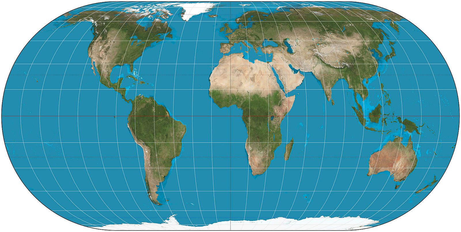
Even without this backstory, Edney, Monmonier and others say there are plenty of better equal-area maps than the Peters. Edney recommends the Ecker IV projection, which preserves the continents’ proportionality and positions without sacrificing too much of their shape. Monmonier thinks anyone concerned with geographic fairness should be using demographic base maps, in which each country’s size is based on its population. Grim thinks the more, the merrier: “If they asked me, what I would advocate is that they have many maps, or several at least,” he says. He is working on an editorial to this effect, which he hopes to publish sometime soon.
Frederick-Clarke—who says he considered a number of projections before settling on the Peters—is sticking by his choice. “It’s a fact that the Peters map is the map that presents the size of the countries in the most accurate form,” he says. If people are surprised at what that looks like, all the better.
*Editor’s Note/Correction: This story has been updated and corrected since it was first published in an attempt to clarify the actions of Boston Public Schools. Mercator Projection maps have not been removed from BPS social studies classrooms, but all new maps purchased will be the Peters Projection.


Follow us on Twitter to get the latest on the world's hidden wonders.
Like us on Facebook to get the latest on the world's hidden wonders.
Follow us on Twitter Like us on Facebook