The Scottish Scoundrel Who Changed How We See Data
When he wasn’t blackmailing lords and being sued for libel, William Playfair invented the pie chart, the bar graph, and the line graph.
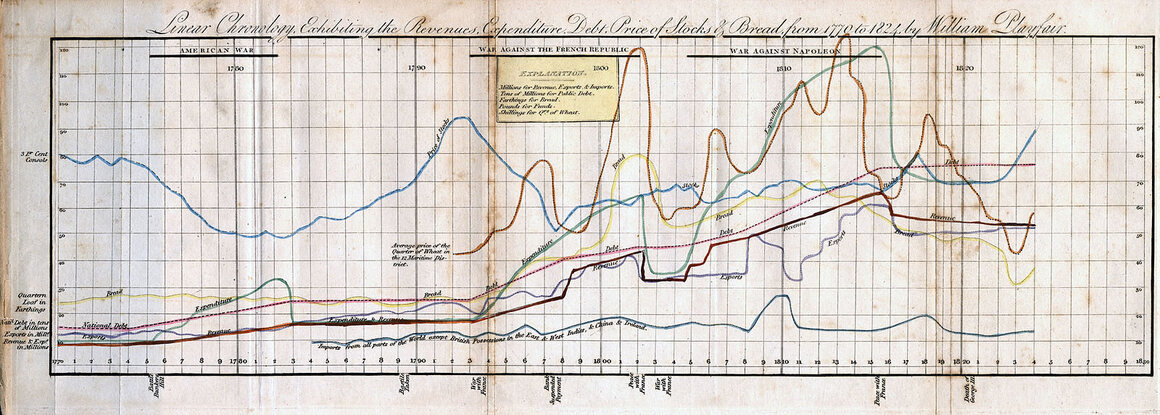
A 1824 Playfair line graph, illustrating of how bread and stock prices are affected by war. (Image: William Playfair/Public Domain)
As news events churn up a flood of new information, many turn to charts to absorb it. Need to swallow an election poll whole? Here’s a pie chart. Want to assess how your city’s public schools are doing? Trace it with a line graph. Feeling a sudden need to brush up on U.K. politics? A whole stack of bar charts might help.
Infographics and data visualizations have become such a part of public life that it’s difficult to imagine navigating our tumultuous times without them. But despite their intuitive power, their basic building blocks—the bar chart, the pie chart, and the line graph—did not simply spring, fully formed, into the public consciousness. They were invented by a man who was, himself, something of a statistical outlier—a boundary-thwarting, Enlightenment-era, near-criminal rascal named William Playfair. Playfair’s particular skills and viewpoint made him uniquely equipped to buck the trends of his time, even as he invented a way to illustrate them.
Today, graphs and charts are seen as more efficient than words, letting us gulp information rather than sip it. For a large chunk of European history, though, this was far from the case. As statistician Howard Wainer explains in Graphic Discovery, 18th century academics actually looked down their noses at anything that resembled a picture.
“Readers were accustomed to persuasion by rhetorical means,” Wainer writes—well-written arguments, perhaps spruced up by a table or two, would get educated people on your side. Illustrations, in contrast, were thought of as inaccurate “trifles,” suited more for working through arguments than for presenting them. There were technical barriers as well: scientists, economists, and others who might have sketched out hasty graphs for their own edification often lacked the necessary artistic skills to engrave them into plates for publication, writes Wainer.
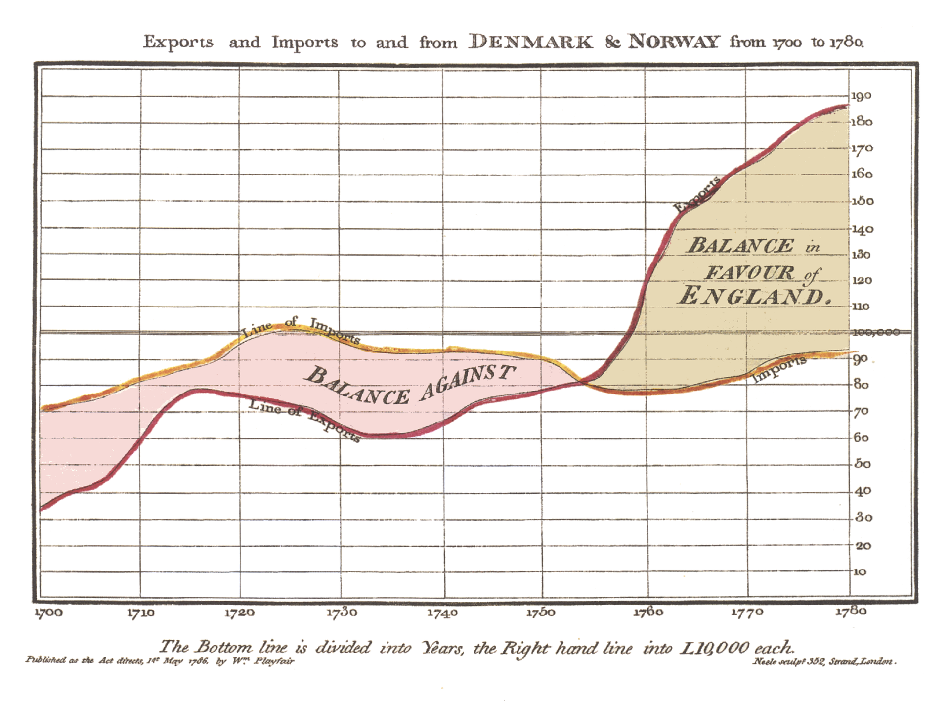
A line graph showing England and Scandinavia’s import-export balance for the 18th century, from Playfair’s 1786’s Political and Commercial Atlas. (Image: William Playfair/Public Domain)
Into this void stepped Playfair, a man with very little regard for tradition. Born in Scotland in 1759, Playfair was a kind of Forrest Gump of the Enlightenment, rubbing shoulders with the era’s many giants, switching careers at the drop of a hat, and throwing himself headlong into history-changing events, from the storming of the Bastille to the settling of the American West.
His graphical inventions, like many of his endeavors, were inspired by a certain disrespect for limits. He wasn’t so much an inventor as an intellectual remixer, taking bits and pieces of different people’s ideas and piecing them together into useful wholes.
“It may fairly be said that he was something of a rogue and scoundrel,” Ian Spence and Wainer write in “Who Was Playfair?”

The world’s first bar chart, from The Commercial and Political Atlas, shows the relative importance of Scotland’s trading partners. (Image: William Playfair/Public Domain)
If you drew up a pie chart of Playfair’s life, it would be made of thin slices, each rich with these various inspirations. Left fatherless at a young age, he was raised largely by his older brother John, who would go on to become an eminent mathematician and geologist. Every day, John had William check the thermometer outside their village home, and mark down the temperature readings on a big chart. This early science lesson stuck with Playfair for decades.
“[John] taught me to know that whatever can be expressed in numbers, may be represented by lines,” Playfair wrote much later, in the introduction to one of his books of diagrams. “To the best and most affectionate of brothers, I owe the invention of [these] Charts.”
After he left home in his late teens, Playfair headed to England to apprentice with the engineer James Watt, whose streamlined steam engine design would soon kickstart the Industrial Revolution. He served as Watt’s draughtsman and clerk, copying complex drawings of his new inventions. Watt was a demanding and critical boss—“I must warn you that Playfair is a blunderer,” he wrote to his business partner, Matthew Boulton, soon after hiring him—but Playfair loved him, later calling him a “natural genius” who “in remote antiquity, would have been deified amongst the inventors of the arts of life.” Under his watchful eye, Playfair honed the artistic precision he later brought to data illustration.

How much money the British Army spent, year by year, as charted in The Commercial and Political Atlas. (Image: William Playfair/Public Domain)
Playfair parted ways with Watt in 1781, at which point he began bouncing from city to city and from trade to trade, mastering none. He started a silversmithing business, which quickly imploded. He claimed to have invented the semaphore telegraph, but was rebuffed by those who actually did. Year after year, he entangled himself in failed economic, personal, and political schemes, such as blackmailing a Scottish lord (he believed the man had purchased his heirs). He was sued for libel, nearly jailed for fraud, and eventually forced to flee France, where he had settled in 1787, after sending some of the country’s aristocrats to settle on American land tracts he didn’t actually own.
Perhaps due to his lack of skill on the ground, Playfair began looking at contemporary situations through a more empirical lens. In 1786, he published The Commercial and Political Atlas, a compendium of bar and line charts representing different European countries’ imports, exports, wages, and other trends for which he had the data handy.
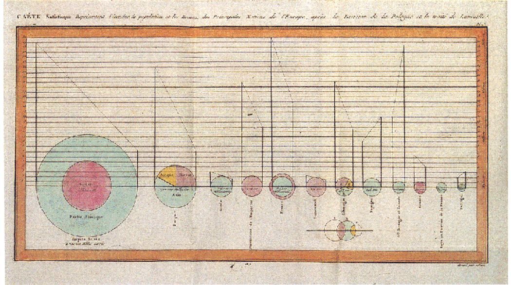
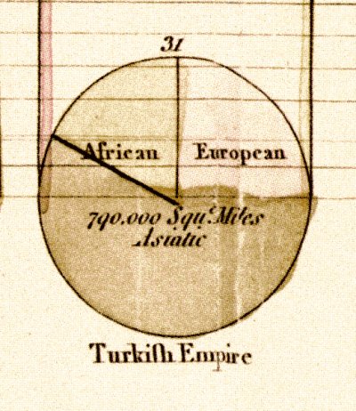
The first pie chart, drawn among other circular charts by Playfair in 1801, and illustrating the Turkish Empire’s land holdings. A closeup of the pie is available here. (Image: William Playfair/Public Domain)
Like many of today’s charts, Playfair’s plots juxtaposed two sets of facts in order to tell a story; also like today’s, they were designed to help busy people understand complex issues at a glance. “As the knowledge of mankind increases, and transactions multiply, it becomes more and more desirable to abbreviate and facilitate the modes of conveying information,” he explained. “Men of high rank, or active business, can only pay attention to outlines… It is hoped that, with the Assistance of these Charts, such information will be got without the fatigue and trouble of studying the particulars.”
Playfair followed up in 1801 with The Statistical Breviary, which, along with more bar and line graphs showing the state of Europe, boasted a new invention: the pie chart. Aiming to illustrate the Turkish Empire’s landholdings, Playfair divided a circle into three proportional slices, each corresponding to a different continent. He then hand-colored the pieces: red for Europe, representing its strength as a land power, green for Asia, to represent its naval prowess, and yellow for Africa, for reasons lost to time (this decision also made him the first to color-code a chart).
In the meantime, he doubled down on his convictions. “No study is less alluring or more dry and tedious than statistics, unless the mind and imagination are set to work,” he wrote in the book’s introduction.
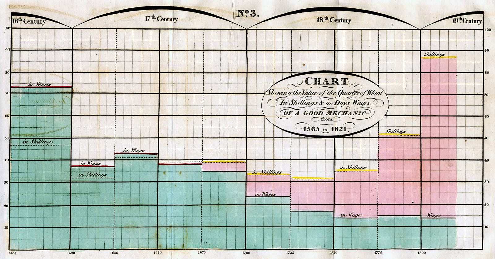
An 1821 Playfair bar chart, which compares the price of wheat to a mechanic’s average daily wages, shows salary inflation keeping up with market prices. (Image: William Playfair/Public Domain)
Playfair realized what he’d done—“I was very anxious to find out whether I was actually the first,” he later wrote—but most others didn’t. His old boss Watt, sent a copy of the Commercial Atlas for review, called the book “mere plummery” and its author “a Rascal.”
Others at the time dismissed it out of hand, “because geometrical measurement has not any relation to money or to time,” as Playfair himself detailed. Perhaps the greatest evidence of the invention’s failure to catch on was the fate of its creator—Playfair died in 1823, “in poverty in relative obscurity, banned from any good society,” writes Douglas J. Hamilton in Jacobitism, Enlightenment and Empire.
Slowly, over the next century or so, the supply of readily available data grew—as did the the public’s appetite for it. Bar, line and pie charts began trickling into newspapers and textbooks. Two hundred years later, as we barrel forward into the Information Age, you can’t click a link without stumbling upon some kind of data visualization. Faced with uncommon times, the common man needs a foothold. It took a scoundrel to finally build one.


.jpg)
Follow us on Twitter to get the latest on the world's hidden wonders.
Like us on Facebook to get the latest on the world's hidden wonders.
Follow us on Twitter Like us on Facebook