How Modern Cartographers Marry Math and Art
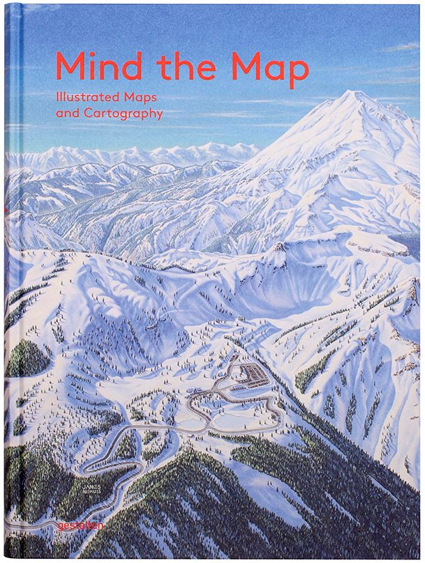
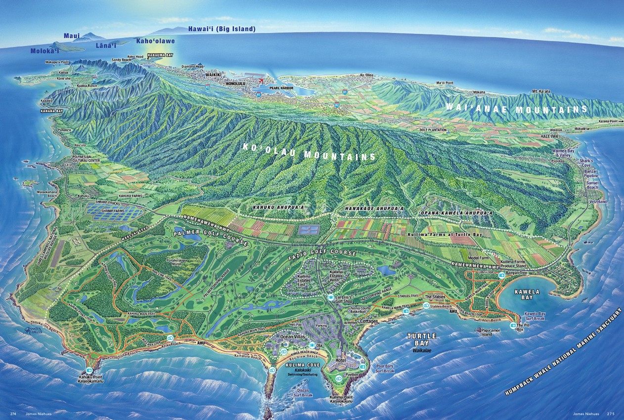 ‘Turtle Bay Resort Map, 2014,’ O’ahu, HI, USA, by James Niehues. (Photo: All images from Mind the Map © Gestalten 2015)
Old maps get a lot of love, and with good reason—with their sea monsters and sheer craftsmanship, they can transport us through both space and time. But although they lack fold-mark furrows, there’s something to be said for new maps, too. Leafing through Mind the Map, a stunning new book from Gestalten, it’s hard not to think we’re living in the middle of a map renaissance, a time when cartographers and illustrators have good design on their minds and satellite data at their fingertips.
This partnership between math and art allows for representations that are not only technically accurate, but also have a sense of a place. Take James Niehues’s 2014 map of Turtle Bay Resort in O’ahu, Hawaii, in which the ridged Ko’olau Mountains loom over the island’s fields and golf courses. Knowing they’re to scale makes the mountains even more impressive, while the relaxing green color scheme reminds you how lush the island is.
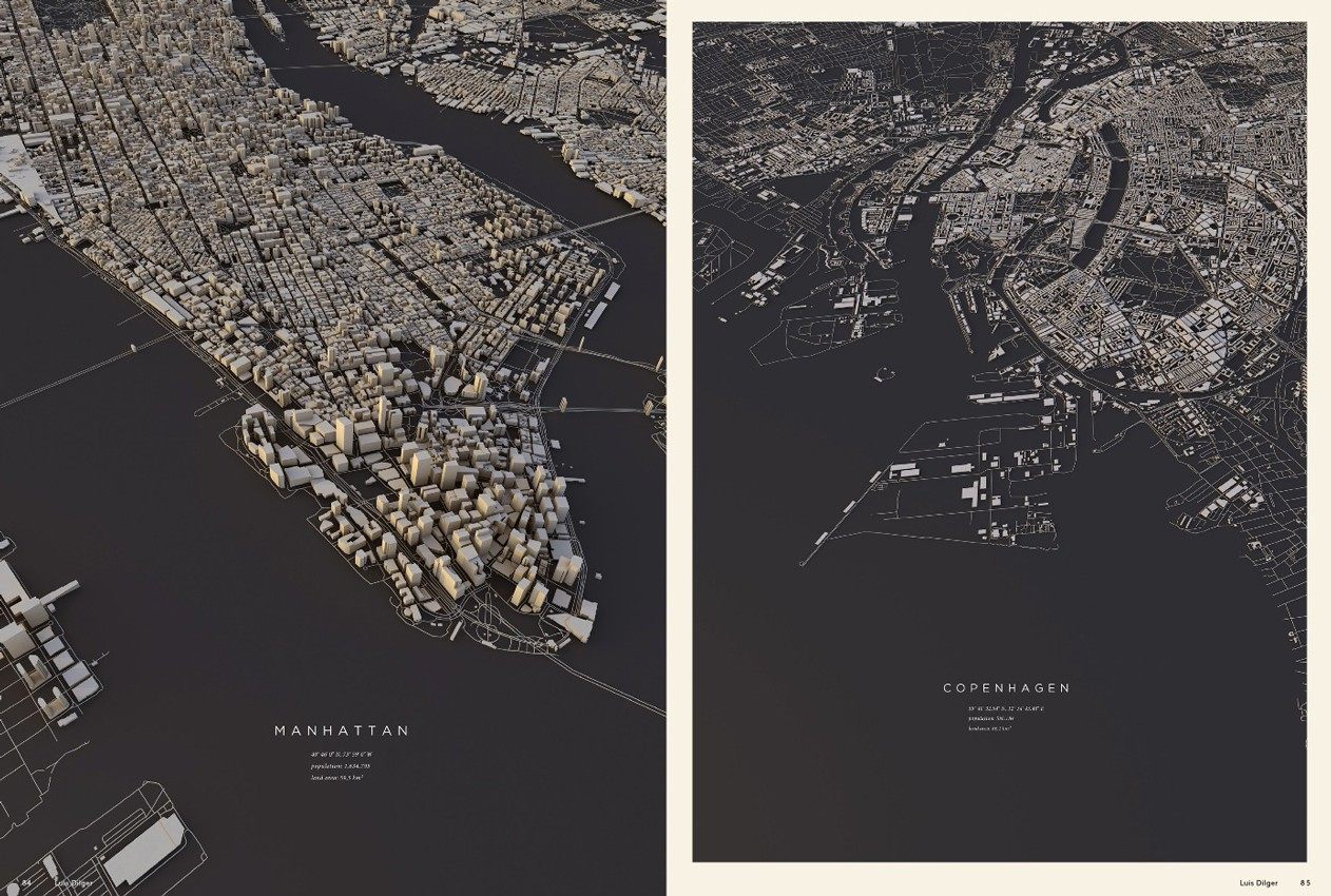 ‘City Layouts, 2015’ of Manhattan and Copenhagen, by Luis Dilger.
Above, Luis Dilger’s unique plane’s-eye views of Manhattan and Copenhagen include “the exact three-dimensionality of [their] topography and buildings,” giving the cities’ skyscraper-heavy downtowns a visceral weight.
In the same vein, Mike Hall’s London street maps, shown below, are entirely hand-drawn, with reverently detailed illustrations of city landmarks in each of the corners. They’re then digitally colored, which adds order and authority to the playful pencil lines.
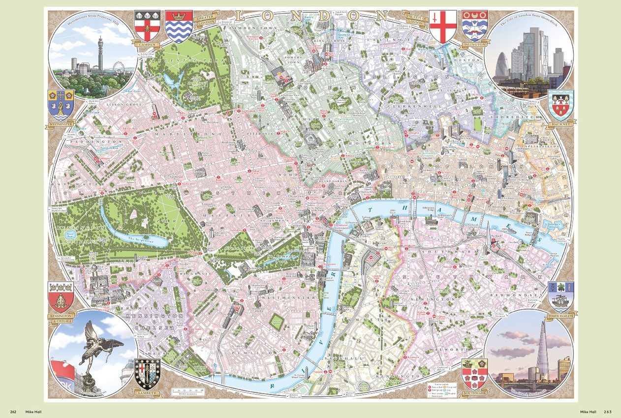 ‘Illustrated map of central London, 2014,’ by Mike Hall.
Other maps are more whimsical. Hipoptam Studio’s version of Nepal is studded with tigers, locals, backpack-laden tourists, bowls of rice, and even a yeti, along with the expected mountains.
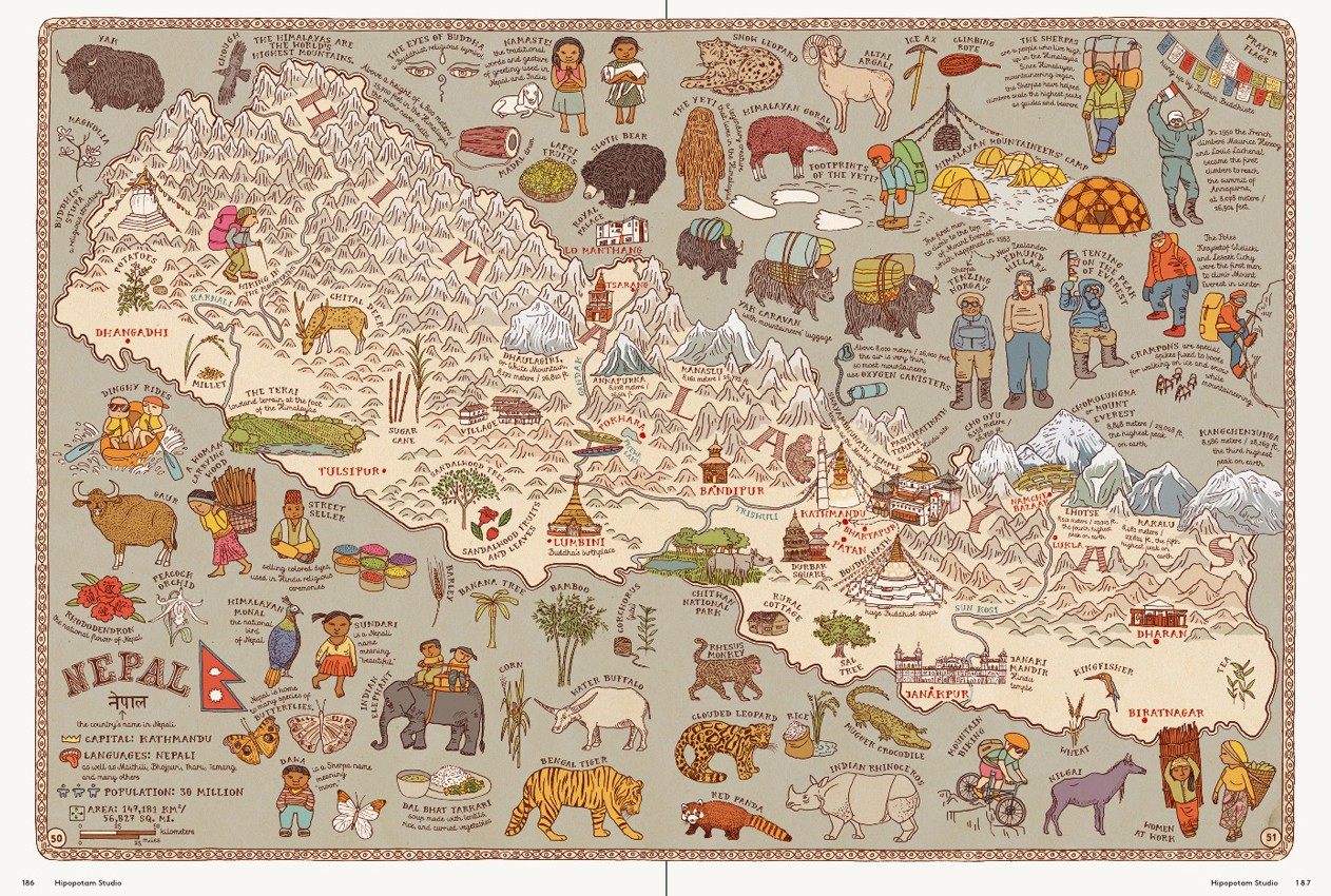 ‘Maps, 2012,’ by Hipopotam Studio.
In Cruschiform’s Toronto, each neighborhood gets a colorful icon based on its perceived personality.
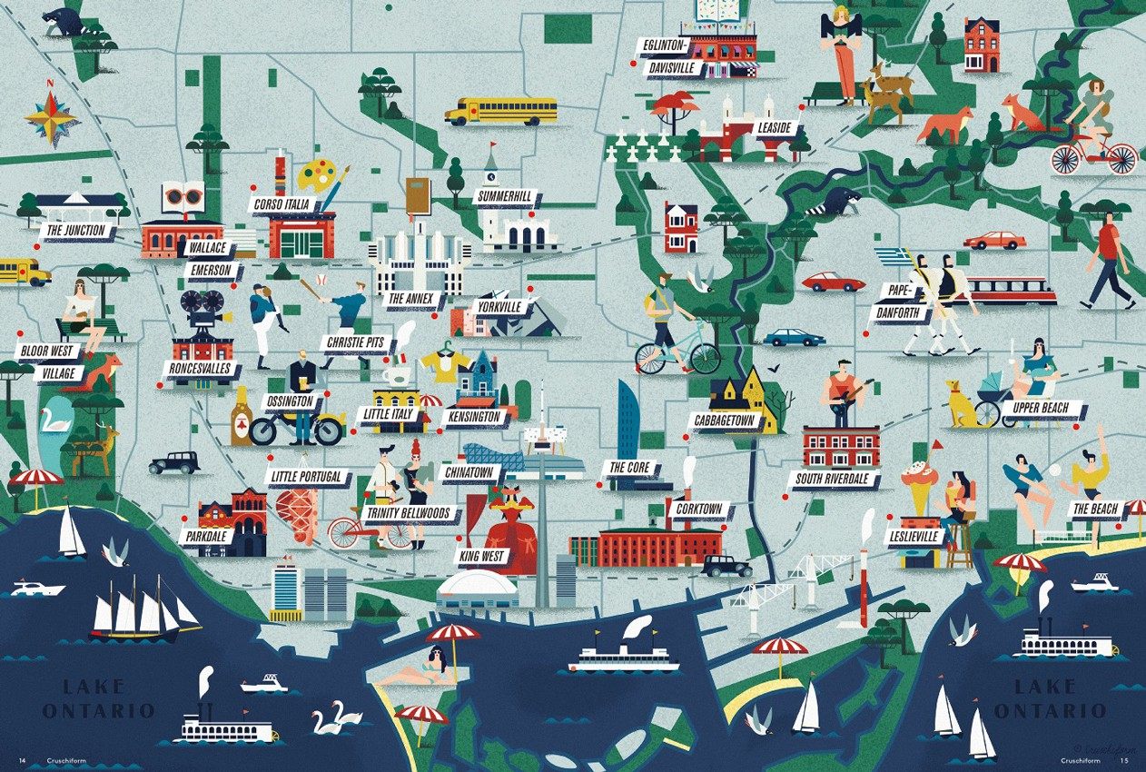 ‘Neighborhood’, Toronto, Canada, by Cruschiform.
Libby VanderPloeg’s Rome has brushstroke fonts and busy people scootering around the stylishly haphazard streets.
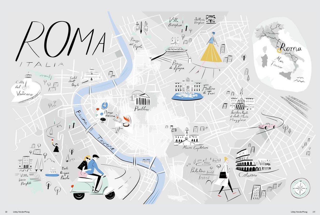 ‘A Map of Rome,’ by Libby VanderPloeg.
In some maps, journeys trump destinations. L’Atelier Cartographik’s map for “the Amelia Project,” during which a distant relative of Amelia Earhart followed the famous aviator’s attempted trip around the globe, is overlaid with clouds and seabirds—and, most importantly, the route itself, which cuts across the world like an EKG line.
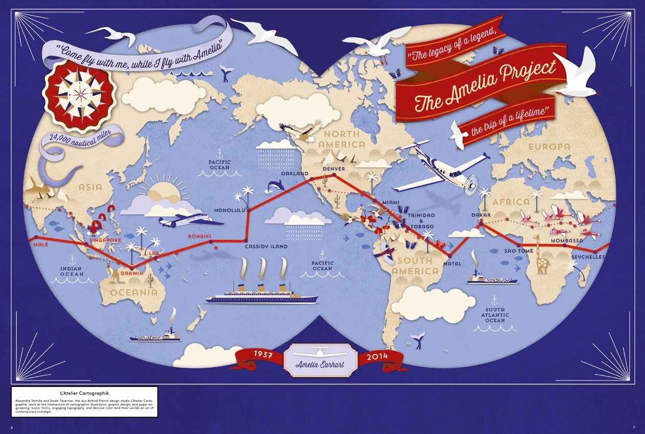 ‘The Amelia Project, 2014’, by L’Atelier Cartographik.
Train maps of Japan and Sri Lanka eschew local detail, and show nearly-blank countries webbed with clear, stark railway lines.
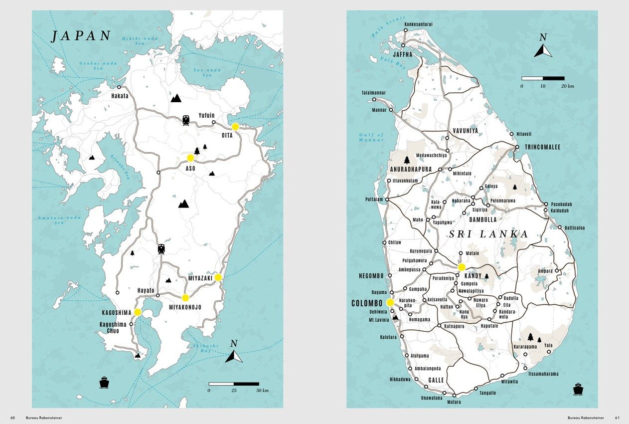 ‘Train Journey Maps of Japan and Sri Lanka.’ Commissioned for book “The Journey – The Fine Art of Traveling by Train,” by Bureau Rabensteiner.
This collection was curated by Antonis Antoniou, the co-author of several other compilations of worldly visualizations, and himself a mapmaker and architect. The book features the work of a new generation of mapmakers, all of them gifted with fresh ways of seeing our ever-changing planet, and the tools to realize their visions.
‘Mind The Map,’ by Gestalten.
Map Monday highlights interesting and unusual cartographic pursuits from around the world and through time. Read more Map Monday posts.


Follow us on Twitter to get the latest on the world's hidden wonders.
Like us on Facebook to get the latest on the world's hidden wonders.
Follow us on Twitter Like us on Facebook