The United (And Divided) States Of Jennifer
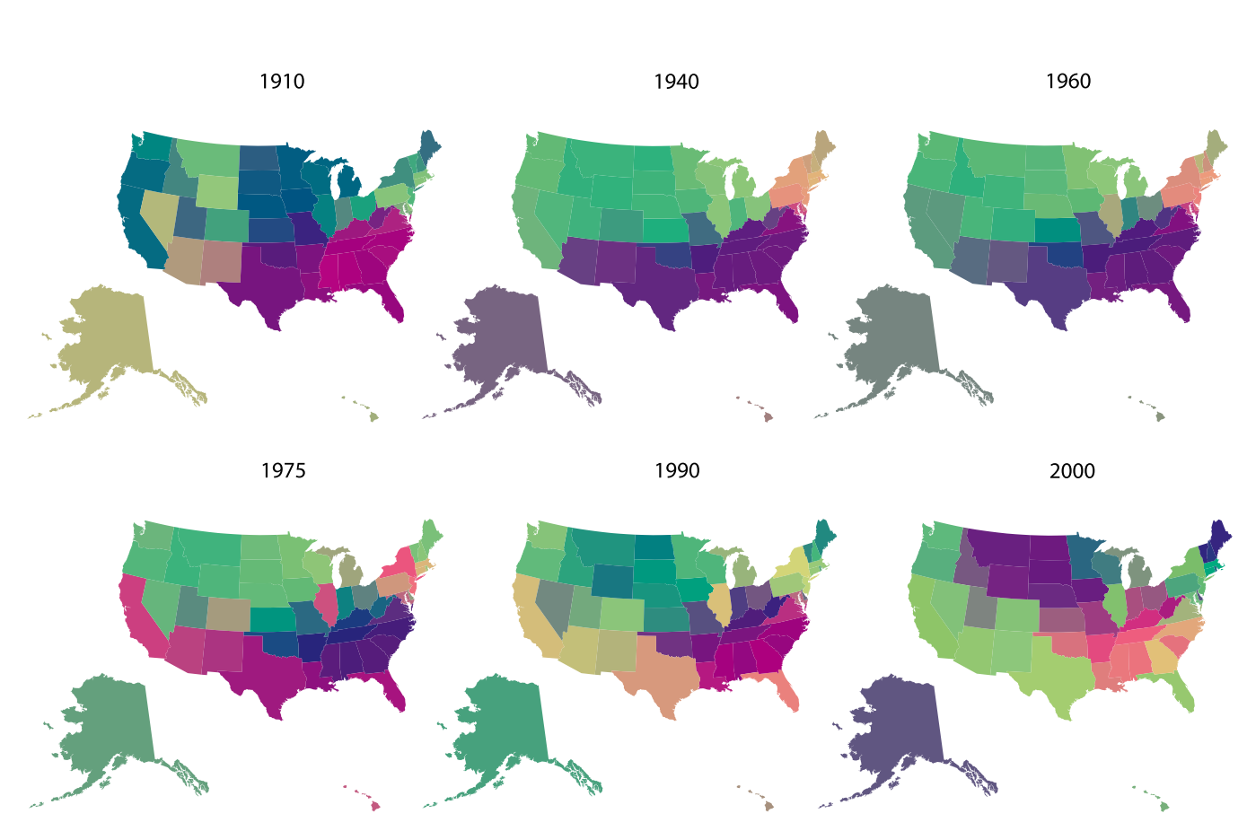
Similarly colored states mean similar baby name preferences. (All images and videos: P. Barucca, J. Rocchi, E. Marinari, G. Parisi, and F. Ricci-Tersenghi/PNAS)
Say you’re an alien trying to figure out the strange cultural brew that is the United States. You want to know how the country has changed over time—which states are similar to each other and which are different, how ideas have spread from coast to coast, whether particular regions like to stick to tradition or groove on the unique. You have a special telescope that lets you keep track of one attribute, state-by-state, and you have a hundred years to sit and look through it.
What do you set it to—political affiliation? Average income? Favorite sport?
What about number of Jennifers?
Sociologists at the Sapienza University of Rome recently published a paper in Proceedings of the National Academy of Sciences which tracked baby names in the United States over more than a century. After looking at the changing popularity of Jennifers (and Cynthias, Barbaras, Patricias, Susans, and so on) in all fifty states, they’ve come out with maps that show which states have similar taste in names from year to year.
A year-by-year assessment of how state baby name preferences are related, put through a “hierarchical clustering” to make groupings more easily visible.
The maps, they suggest, don’t just show how well Lisa has fared against Linda—they hint at how the country’s cultural landscape has shifted. When you watch the colors move from a stark north/south split to a blotchy pastiche, you’re seeing what the authors describe as a “deep transformation” in the country after the Vietnam War—one that meant New York and Illinois suddenly had more Michaels in common with California than with their own neighbors. And as you notice the 21st century’s increasing variety of shades, you’re seeing tradition give way to innovation.
This is because, to sociologists, baby names aren’t just baby names—they’re a cultural trait, a behavior shared by members of a community, like greeting methods or manner of dress. Just as evolutionary biologists can tell a creature’s ancestry by figuring out what traits it has in common with other species, sociologists try to measure cultural evolution by tracking the social spread of, say, the handshake.
This video shows how similarity between states’ name preferences has shifted year to year. It goes well with music.
In certain situations, it can be useful to study what the authors call “neutral traits,” where making a particular choice has no overt cost or benefit. The study cited examples including “skirt lengths, pop songs, dog breeds, pottery decorations … and keywords in academic [papers].” Baby names are not only a choice-based neutral trait, they’re one that the government has been keeping reliable and extensive track of for decades, allowing for studies like this.
Of course, the world gains preference-measuring digital databases every day now, and so sociologists (and interested aliens) will have a lot more to work with in the future. Someday, maps like these might even show whether dreams travel, or what really led to the great Pizza Topping War of 2114. But for now, we’re left with Jennifer, and the secrets she imparts.
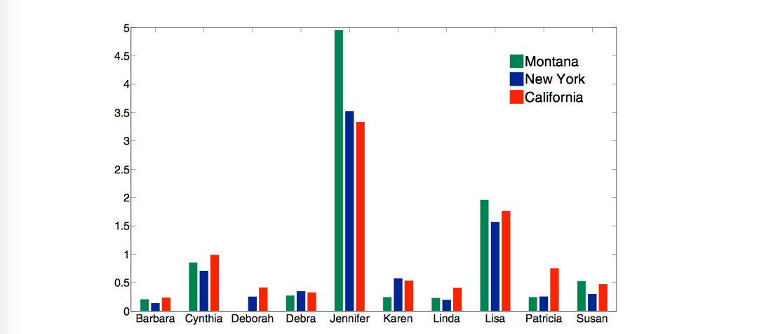 This histogram shows the relative popularity of America’s top ten female names in different states in 1980.
Map Monday highlights interesting and unusual cartographic pursuits from around the world and through time. Read more Map Monday posts.


Follow us on Twitter to get the latest on the world's hidden wonders.
Like us on Facebook to get the latest on the world's hidden wonders.
Follow us on Twitter Like us on Facebook