Mapping the Census Like It’s 1870
(All images used with permission of Flowingdata)
Data nerds, reporters and concerned citizens all love the firehose of data that is the U.S. Census, begun in 1790. But while current Census sites have all kinds of interactive maps, it turns out that data visualization was perhaps even more beautiful in the old days.
Thankfully Nathan Yau, author of the statistics blog Flowingdata, has set to fixing this clear-and-awesome-maps-and-graphs-shaped hole in the culture.
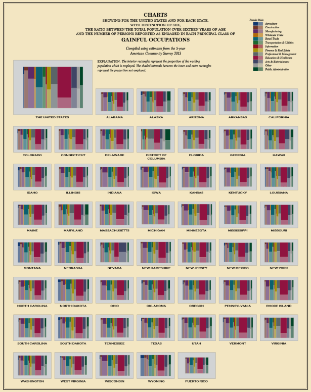
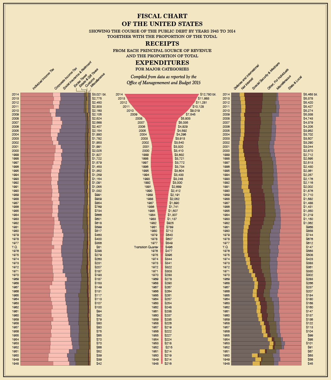
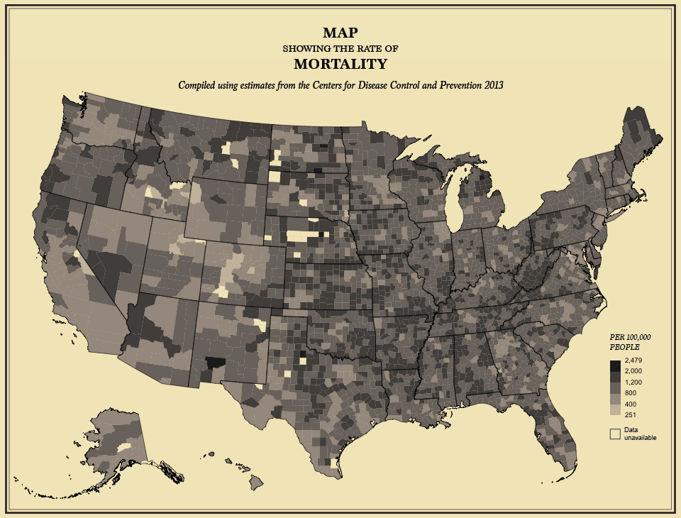
After the Census of 1870, a volume was published by the Census Bureau called the Statistical Atlas of the United States. The thin, 56-page pamphlet was a gold mine of tightly-packed statistical goodness, covering topics including race distribution, political borders, gold mines, forests, and even the life expectancy of the average American. The blocks of dry, but informative text were even spruced up with inset graphs and tables to help readers better understand the expansive data sets.
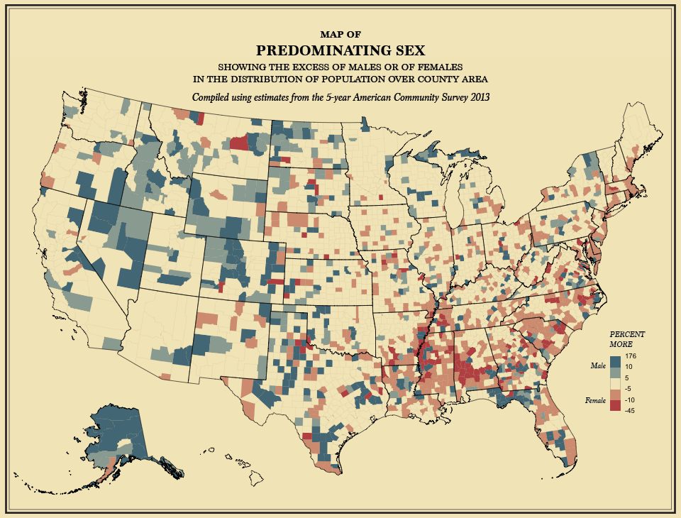
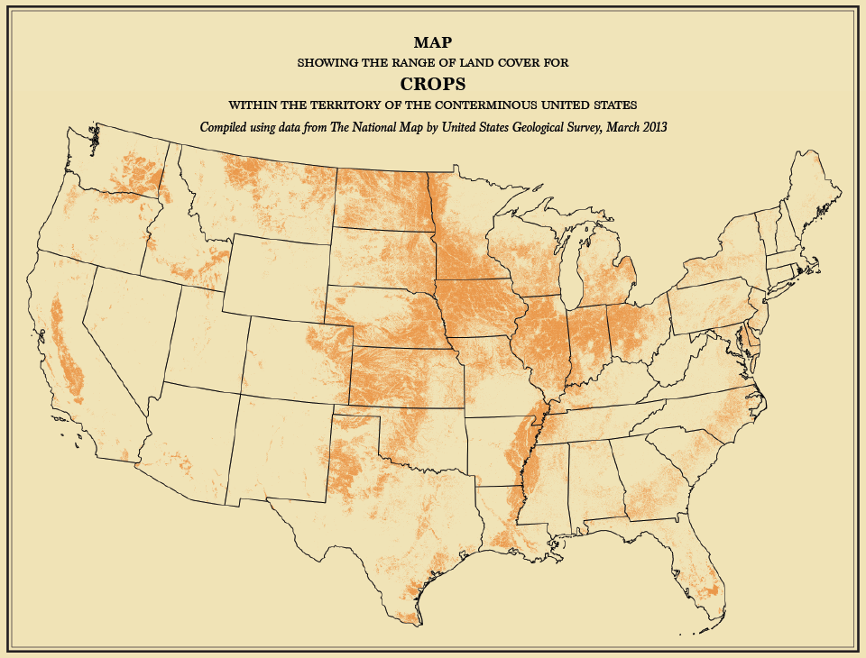
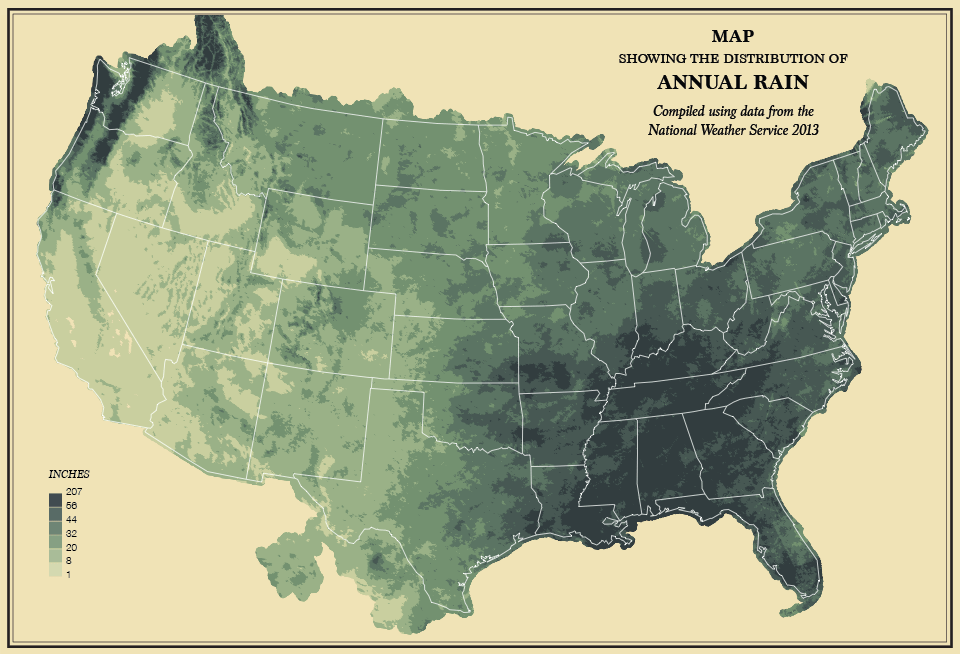
Yet the finest aspect of the Atlas was the old maps that were densely covered in lines and colors of information. The small selection of maps showed everything from how rainfall was distributed across the nation to how much woodland remained in the country, all described in the elegant language of vintage maps.
Following the publication of the initial Statistical Atlas, a new edition was published every ten years following the census. That is until the Census of 1930. Interest in its publication had been declining, as flourishes that had made the first few so engaging and artful (color maps, contextual introductions) and the Atlases were slowly abandoned. The Census Bureau officially discontinued the production of the Atlas following the 1930s Census.
Finally in 2000 the Census Bureau produced the Census Atlas of the United States, an informative atlas containing maps and all the domestic numbers you could ever want. But come 2010, no new Atlas was produced.
Flowingdata is there to save us from this analytical desert. Yau has taken it upon himself to recreate a version of the Statistical Atlas of the United States that has all the charm of the 1800s editions, but all the hard data of 2010. Like the Atlas’s predecessors Yau’s maps cover population density, weather, the distribution of natural features, death, money, and more with easy to understand visualizations. He even put together some lovely charts for fans of data set art. Gone are the thick blocks of text; Yau’s project focuses on the beautiful maps. Take a look below at some of his amazing retro-modern analytics.


Follow us on Twitter to get the latest on the world's hidden wonders.
Like us on Facebook to get the latest on the world's hidden wonders.
Follow us on Twitter Like us on Facebook