Not All Digital Maps Are the Same
Google Maps and Apple Maps show two very different views of the world, a recent essay argues.
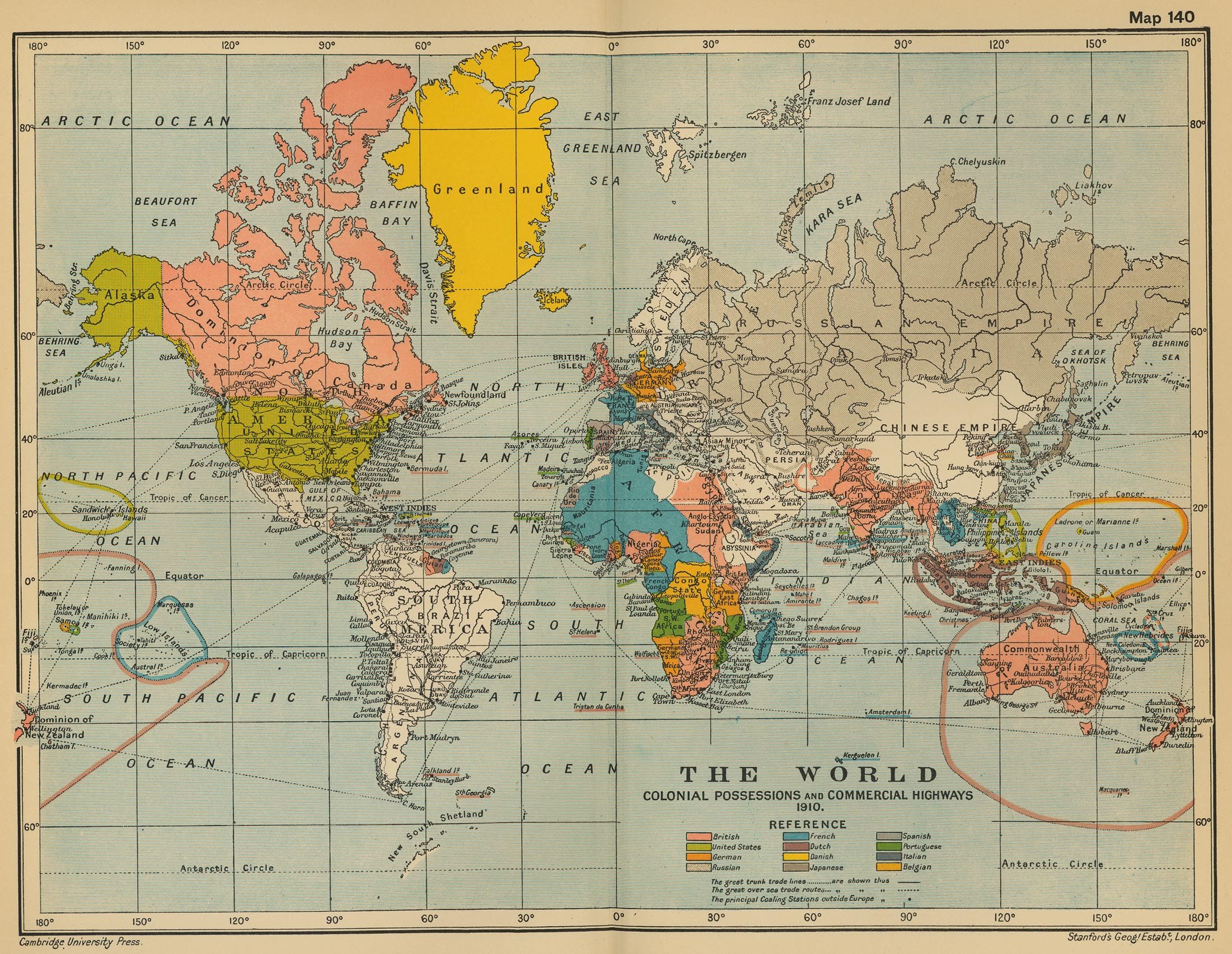
A world map from 1910, when maps could become outdated. (Photo: Patrick Barry/CC-BY-SA 2.0)
Thanks to smartphones, humans have the ability to navigate up-to-date, geo-located global maps with astonishing ease. As writer Justin O’Beirne puts it, “Today’s best and most popular maps are with everyone, all of the time.”
But, given that most of the world is using either a Google map or Apple Maps, are we seeing the same thing?
To answer this question, O’Beirne began an in-depth comparison of the two maps, publishing the first essay in a planned four-part series this month. As it turns out, the two maps have some striking differences in what they show their users.
To compare the two maps, O’Beirne chose three major cities (New York, San Francisco, and London) that can reasonably be assumed to have dense, complete maps and be inclusive of a wide variety of places of interest. Each city’s map was centered on a major landmark approximately in the center of the city (the Empire State Building, Patricia’s Green, and Nelson’s Column, respectively). For each city, O’Beirne created 18 maps at different zoom levels in each app—a total of 54 maps.
With his 54 maps in-hand, O’Beirne compared the way Google and Apple display cities, roads, and places at various zoom levels. And he’s found that while many might assume that the maps are essentially interchangeable, they actually are strikingly different.
Basically, Apple Maps tends to label cities more than roads, while Google Maps does the opposite, although both maps show the same number of roads in two-thirds of all zoom levels. So Apple Maps is a good bet if you need to know the names and locations of the suburbs of New York City, but Google Maps will tell you where I-95 is.
But what’s really interesting is the major differences between the places of interest each map shows. Google Maps is heavily biased towards transit—although, oddly, it doesn’t show every transit station—while Apple Maps tends to highlight landmarks. In fact, on average, only about 15 percent of the places of interest shown on any map are the same for Apple and Google, with Apple tending to show a greater variety of places, as well as more shops and restaurants.
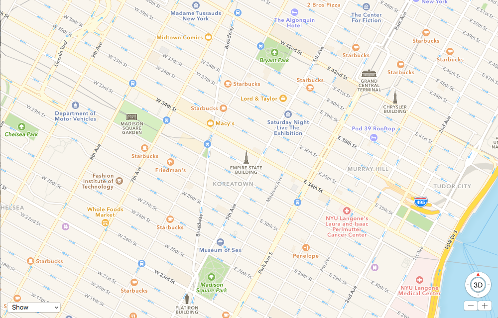
The area around the Empire State Building according to Google Maps. (Map data © 2016 Google)
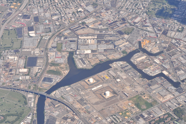
And the same area according to Apple Maps. (Map data © 2016 Apple)
As O’Beirne points out, the maps show “two very different views of the world” — one focused on places to go to, the other on how to get there.
So, if you’ve ever found yourself earnestly arguing that Apple Maps is the better way to find a restaurant, or Google Maps’ subway directions are more accurate, good news! It may not be entirely in your head. And whether or not you have a strong preference for what kind of information is presented on your map, the apps’ capacity for constant updates and localization make them indispensable whether or not your favorite Thai restaurant appears. In future essays, O’Beirne plans to examine the two maps’ labels, details, and overall styling; it’ll be interesting to see if one map proves decisively better for a seeker of the curious and wondrous.


Follow us on Twitter to get the latest on the world's hidden wonders.
Like us on Facebook to get the latest on the world's hidden wonders.
Follow us on Twitter Like us on Facebook