The Unsung Ranger Behind the U.S. Forest Service’s Iconic Signs
Career ranger Virgil “Bus” Carrell had no design training, but “really gave a damn,” say experts, about his lasting legacy.
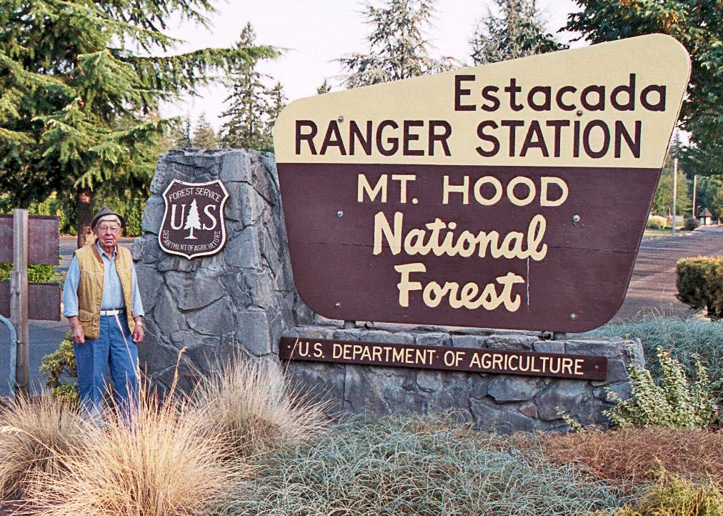
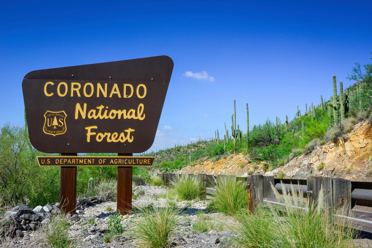
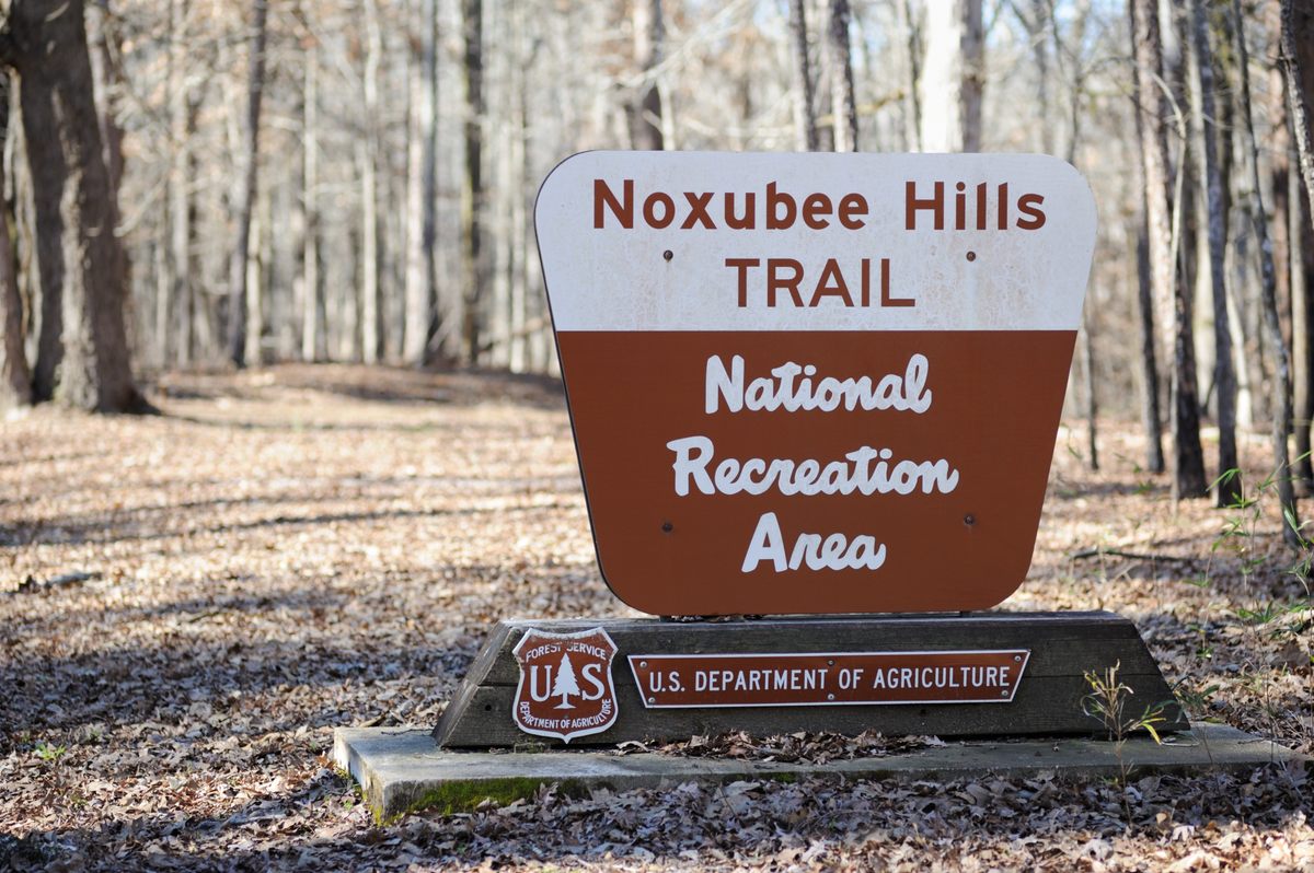
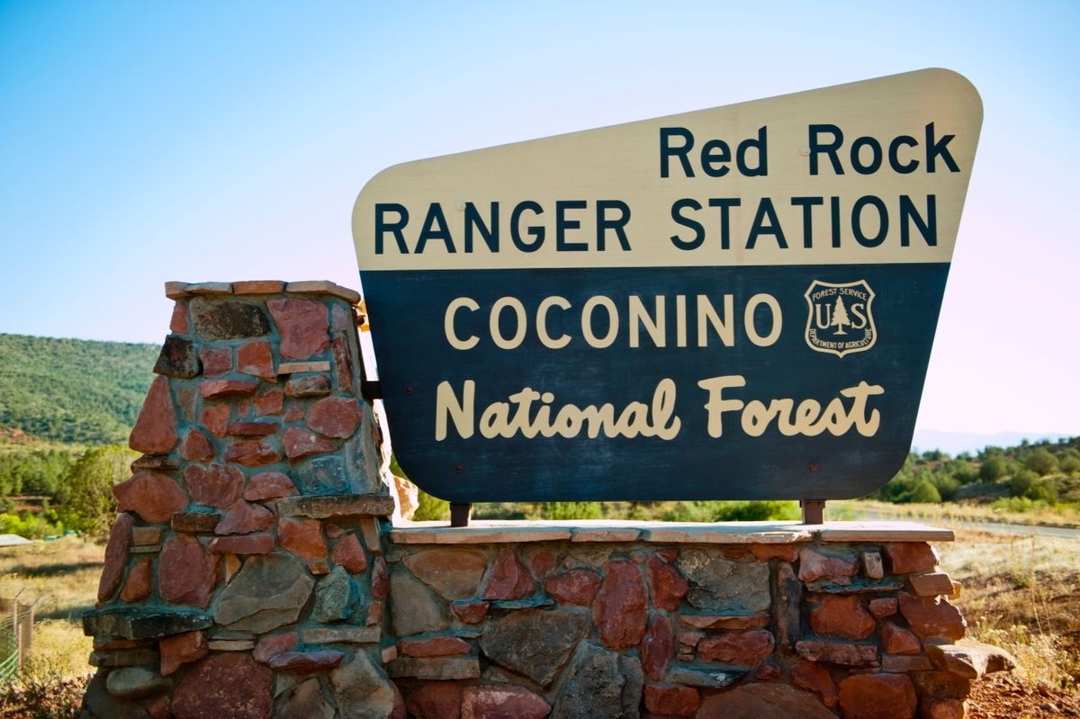
Most Americans haven’t heard the name Virgil “Bus” Carrell. But drive across the country and you’ll see Carrell’s work. And if you’ve entered a national forest, driven to a natural monument, or crossed the Continental Divide, you’ve probably even pulled over and snapped a selfie next to one of his creations. Those quirky brown-and-cream trapezoids, with the retro typeface that welcomes you to a U.S. Forest Service-managed site, are his legacy. Over the last half-century, those signs have become not only instantly recognizable, but iconic.
“Whoever designed these signs really gave a damn,” says designer Charles Spencer Anderson, whose influential Minneapolis-based firm specializes in identity development. “I don’t know if they had a sense of history when they designed these things, but it appears they understood the gravity of the assignment.”
Carrell had no formal design training, but he understood that the project to create signage for Forest Service properties coast to coast called for something special. Carrell and his team would create what he called a “family of shapes,” each sign an individual but clearly related to the others. For example, signs marking the Continental Divide are shaped like bow ties, as if two trapezoids were joined in the middle, but sport the same colors as the asymmetrical trapezoids welcoming you to scores of National Forests, and smaller symmetrical trapezoids at trailheads.
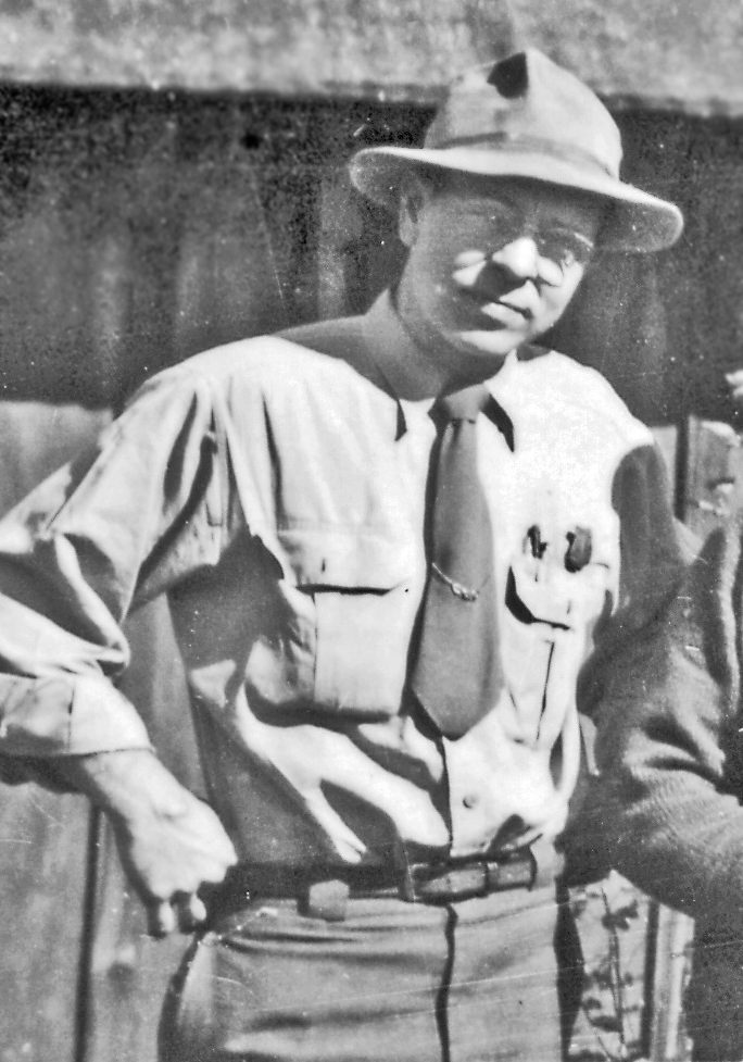
A ranger most of his life, Carrell may have seemed an unlikely design savant. He graduated from the University of Washington College of Forestry in the 1930s and immediately went to work for the Forest Service, immersing himself in every assignment from trail maintenance to fire prevention. “Before I was born, he and my mother even lived in a fire lookout tower for a while in Oregon,” says Carolyn Dennison, his daughter.
As District Ranger for Mt. Hood’s Clackamas River area, Carrell managed the heaviest timber business in the country. He also supervised search and rescue operations, coordinated campground maintenance, and organized fire prevention efforts for areas so remote that teams traveled on horseback. “People were excited to work with him because he always knew what he was doing,” says Dennison. “And he didn’t just delegate. He was hands-on all the way.”
Carrell was recognized as Ranger of the Year in 1949. About a decade later, he was promoted to a position at the agency’s head office in Washington, D.C. He packed up his family and left the mountains of the West at a time when the Forest Service was undergoing its own transition.
Starting in the 1950s, road tripping was becoming a quintessential American pastime. As the Great Depression and World War II receded in their rearview mirrors, Americans were buying bigger cars and taking their families around the country. National forests were seen as ideal places to camp, hike, fish, and boat. Visits were spiking. And with heightened visibility came the need, according to Carrell’s bosses, to “review and modernize the Forest Service’s sign program.”
This was not the federal agency’s first foray into brand identity. In 1944, it had hired a young artist named Rudy Wendelin to help launch a fire prevention campaign. Wendelin, a fresh talent with a Hemmingway beard, created a new character: an anthropomorphic bear in a ranger’s hat named Smokey. When Carrell was put in charge of the sign project, Wendelin became his right-hand man.
Carrell, Wendelin, and two landscape architects began their work with a tour of Forest Service-managed areas. They found some entrances marked with the agency’s official shield, others with hand-drawn placards or metallic eyesores. Some signs merely had the property’s name. Others featured entire histories. What they didn’t see anywhere was consistency.
Based on his observations, Carrell developed a philosophy summed up in his essay “Signs to Complement Natural Beauty.” It reads like Sun Tzu’s The Art of War for forest signs: “A sign does not have to be the gaudiest, the biggest, and the most colorful to be the best one,” and “The text should develop no more than one topic and have a warm tone.”
With Wendelin’s sketches, Carrell presented his family of shapes concept in Washington. “Dad wanted to have a good, big sign that would fit in with nature, and yet be obvious that that’s what it was the minute you saw it,” says Dennison. “It was quite an ordeal to get all the designs the way everybody wanted. But Dad got what he wanted.”
Ranger Les Joslin helped install some of the first signs in 1963 while working at the Humboldt-Toiyabe National Forest, which spans Nevada and eastern California. “Our district maintenance guy built the thing, and we helped hold things in place while they were all screwed together,” says Joslin, now retired and author of several books on Forest Service history. “For a while, I thought, why in the world are they replacing that nice shield-shape sign? But I think the family of shapes that Bus and his group came up with really tell the story well.”
Rob Sparks, who served in the Forest Service in Utah and Colorado during the 1990s, grew up in Idaho with these signs as part of his landscape. “As far back as I can remember, those signs represented something different. That shape and the colors from the time I was a little kid meant something was changing when you crossed that border.”
Today, signs belonging to Carrell’s family of shapes are used to identify hiking trails, ranger stations, and scenic overlooks. They even appear on unofficial souvenirs, from magnets to keychains, in tourist shops nationwide.
“These signs do two things at once, which is a really tricky balance,” says Anderson. “It’s a contrast between the natural materials and then this weird shape that comes out of the blue. There are a lot of contradictions going on here, but it’s incredible how well they work.”
In retirement, Carrell moved to Arizona and made occasional contributions to Old Smokeys, a newsletter for retired rangers. He passed away in 2014, two months short of his 100th birthday.
Today, the design and implementation of the agency’s signs are carefully prescribed in Sign and Poster Guidelines for the Forest Service, which outlines everything from sign maintenance to approved colors. It’s over 600 pages long. Yet neither Rudy Wendelin nor Bus Carrell are mentioned in the document. When asked about the signs’ design history, Babete Anderson, national press officer for the Forest Service said, “We just do not have that much institutional knowledge around anymore.”
Carrell’s grandchildren at least are aware of his legacy. Says Dennison: “We still tell them to place their hands over their hearts each time they pass one of Grandpa’s signs.”


Follow us on Twitter to get the latest on the world's hidden wonders.
Like us on Facebook to get the latest on the world's hidden wonders.
Follow us on Twitter Like us on Facebook