In Spanish America, Cartographers Hand-Drew Maps Inspired by Printed Ones
These hybrid productions are unique in mapmaking.
Late in the 16th century, mapmakers in Spanish Empire, working on continents across the ocean from Europe, didn’t have access to the age’s best technology. Though the first printed maps in Europe had been made a century before, map printing had yet to make it to the Spanish American colonies. When they needed to make maps, they still made them by hand.
This was at the height of Spain’s global influence, what’s sometimes called the Siglo de Oro, the country’s golden age. To better understand and control the vast areas the Spanish Crown had claimed around the world, King Philip II ordered a survey. Each local administrator had to send back a map detailing the land he oversaw.
The dozens of maps were sent back to Spain. But among these, Manuel Morato-Moreno, of the University of Seville’s Department of Graphic Engineering, discovered a small set unlike the rest. Drawing from ways of mapmaking old and new, influences from Europe and from Central America, these maps adopted and imitated techniques specific to printed maps—but were all hand-drawn.
It’s as if a magazine designer in the 1990s tried to imitate the style of a early website. (And surely that must have happened? Clue us in if you know the perfect example.) Only, these maps had other unique characteristics, too, drawn from the place they were made. They mixed the conventions of the time’s European cartography with indigenous influences and earlier European map and illustration tropes.
These maps—seven in all, made in 1579 and 1580—“present a peculiar style,” says Morato-Moreno, with a “dose of ingenuity” unparalleled in the whole, extensive corpus of maps made of Spanish America in the 16th century.
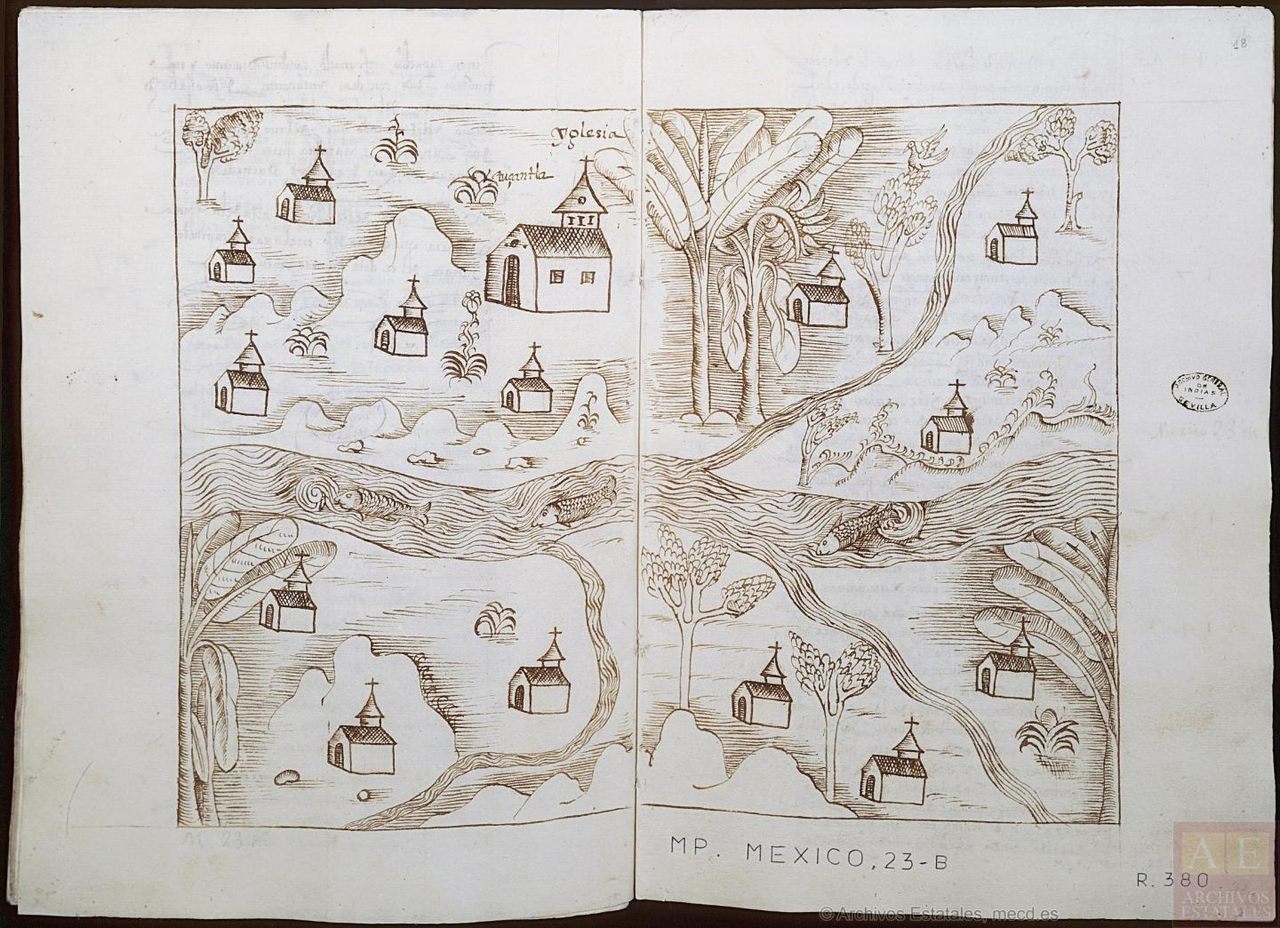
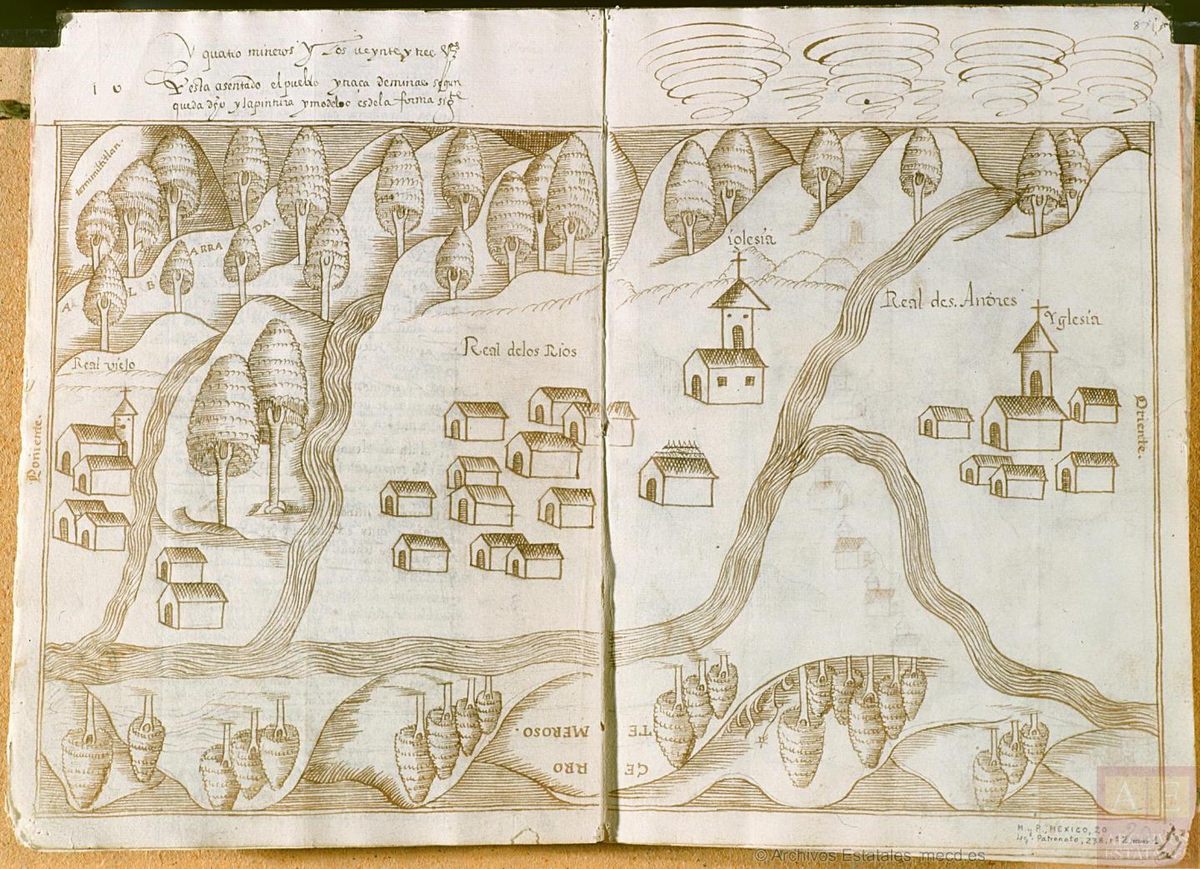
Morato-Moreno describes the maps in a paper for the journal Cartographica. Two describe the settlement of Ixcatlán, in an area that today is the province of Oaxaca. The other five are of towns in the Temascaltepec region, where the Spanish opened silver mines, not far from Mexico City. It’s not known for sure who made these maps, though scholars think a chief magistrate, responsible for the survey, may have been responsible for the first two, and that a traveling Spanish scribe may have drawn the other five.
The Ixcatlán maps adopted a technique popular in printed maps, in which a black-and-white, inked map is later colored with paint. All of them use a hatching technique to create depth that is distinctive of etched, printed maps. The maps also repeat the same symbols to signify small towns, larger settlements, trees, and other features, another technique that would have been common on printed maps. Barbara Mundy, a scholar who previously analyzed a subset of these maps, wrote that they resemble landscape prints more than maps. The Temascaltepec maps go even further toward imitating printed products—they are bound together like a book.
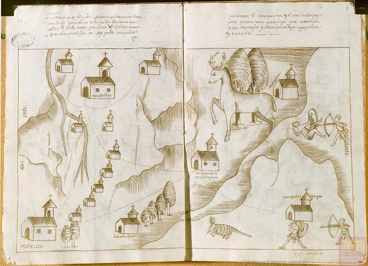
The map of Texcaltitlán, with an oversized deer and tiny figures of indigenous people, is trying to do more than document practical geography. The figures are as much artistic flourishes as pieces of important information. They’re meant to create depth and possibly to “enliven the middle distance and foreground,” Morato-Moreno writes. In the bottom left corner of the map, the artist has added Mexico City. If the map were drawn to scale, or with an eye towards geographic accuracy (as some of the maps were), Mexico City would never have been included. But the poetic and political aims of the mapmaker extended beyond navigation. The map tries to show the importance of Texcaltitlán by emphasizing its economic connection with the most important city in this part of the world, from Spain’s perspective, at least.
The map of Tuzantla is notable for a different reason. It communicates economic information through the images of leafy trees: Bananas were an important resources in the area. The river that flows through the map has unusual details, too. The water flows with eddies and squiggles. This way of representing water wasn’t a convention of European printed maps, but rather of indigenous cartography.
“These indigenous conventions in coexistence with European cartographic practices suggest an effort at accommodation between the two cartographic modes,” writes Morato-Moreno. “The authors of these maps may have unconsciously mixed European and native conventions.”
These striking maps are a product of a specific time and place, in which old and new influences, technologies, and techniques muddled together into unique representations of geography. Funnily enough, as Morato-Moreno points out, the first printed maps tried to imitate hand-drawn maps. These 16th century maps flipped this influence, drawing on the conventions of European printed maps and indigenous methods of representing geography. “They are a hybrid product,” says Morato-Moreno. There’s been nothing exactly like them before or since.


Follow us on Twitter to get the latest on the world's hidden wonders.
Like us on Facebook to get the latest on the world's hidden wonders.
Follow us on Twitter Like us on Facebook