A Map of Fires Burning All Across the Globe
From above the Earth, it’s possible to see how much is aflame.
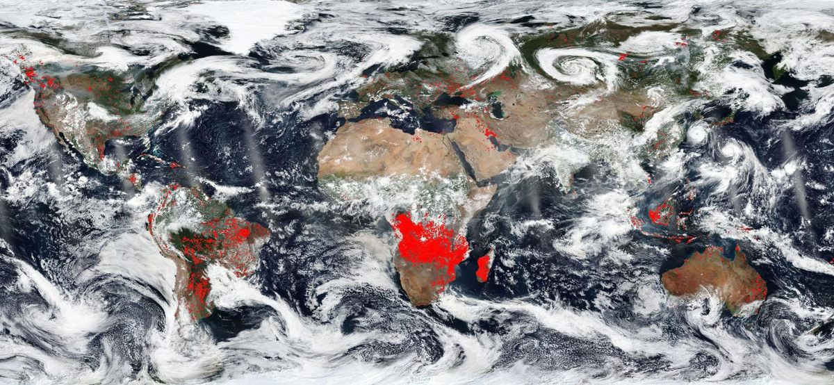
As NASA satellites orbit the Earth, they’re collecting information about the planet below. In the thermal infrared band, the satellites’ instruments can detect bits of the earth that are heating up, including active fires.
Al over North and South America, wildfires are burning bright. California’s Ranch Fire is the largest in the state’s history; the Pacific Northwest is blanketed in smoke blown down from fires in British Colombia. Last year, Chile’s wildfires broke records.
In a new map of the world’s wildfires, released by NASA Worldview, the red patches depict active fires. That bright band in Africa represents agricultural fires, set deliberately to help renew the land. In Brazil, the red dots are a mix of wildfires and fires set to clear crops. In North America, the fires weren’t set deliberately, but they’re influenced by human activity—how we manage the forests, how our contributions to climate change have made summers drier, raising the risk of fires growing and spreading.
It can start to seem like the entire world is on fire: There’s a lot of red on that map. Outside of Berlin, three German villages were evacuated as a fire closed in; Oregon rushed to put out a canyon fire; hurricane winds in Hawaii started a brush fire. This summer there were even fires north of the Arctic Circle, a rare occurrence. And this may be the situation going forward, as arid parts of the world dry out and raise the risk that a small flame—a campfire, a lightning strike—can spark a giant blaze.


Follow us on Twitter to get the latest on the world's hidden wonders.
Like us on Facebook to get the latest on the world's hidden wonders.
Follow us on Twitter Like us on Facebook